Main references (my holy bibles for this lesson)
remi.mahmoud@agrocampus-ouest.fr
https://data-visualisation-lesson.netlify.app/

![]()
Data visualization is one of the most visible aspects of statistics in the public sphere, making it an essential skill to master.
A visual masterclass (at the time) by Charles Joseph Minard.
“It may well be the best statistical graphic ever drawn” (E. Tufte, the visual display of quantitative information).
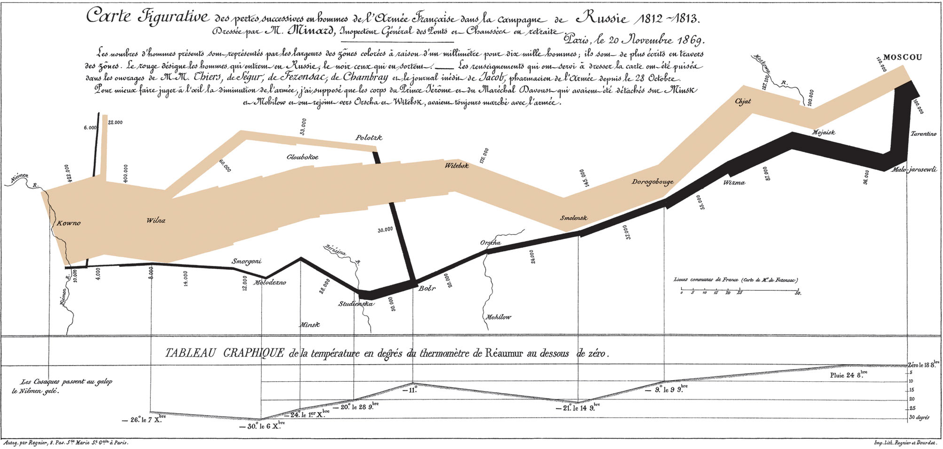
Par Charles Minard (1781–1870) — Domaine public, https://commons.wikimedia.org/w/index.php?curid=297925
What do YOU think ?
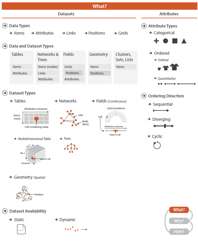
Data and information visualization (data viz) is the practice of designing and creating easy-to-communicate and easy-to-understand graphic or visual representations of a large amount of complex quantitative and qualitative data and information with the help of static, dynamic or interactive visual items (Wiki).
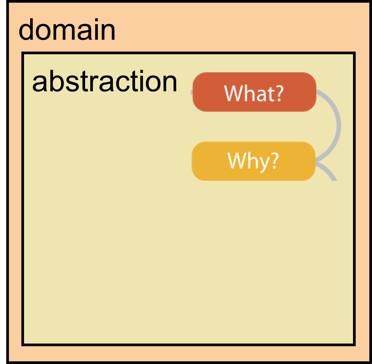
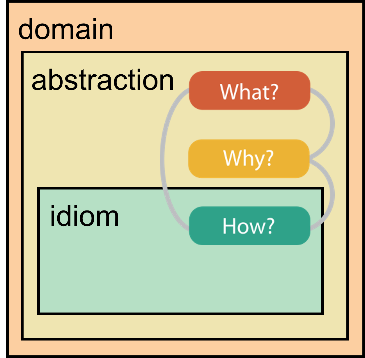
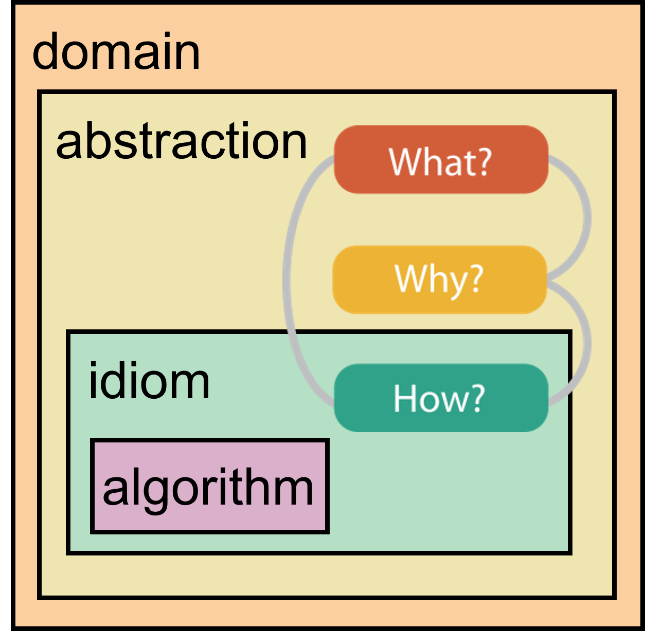
An idiom: a distinct approach to creating and manipulating visual representations (bar charts, histograms, scatterplots etc.)
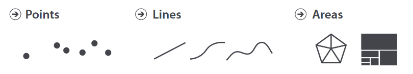
Some examples for each data type ?
Visualization Analysis and Design. Tamara Munzner, with illustrations by Eamonn Maguire. A K Peters Visualization Series, CRC Press, 2014.
Visualization Analysis and Design. Tamara Munzner, with illustrations by Eamonn Maguire. A K Peters Visualization Series, CRC Press, 2014.
Visualization Analysis and Design. Tamara Munzner, with illustrations by Eamonn Maguire. A K Peters Visualization Series, CRC Press, 2014.
Visualization Analysis and Design. Tamara Munzner, with illustrations by Eamonn Maguire. A K Peters Visualization Series, CRC Press, 2014.
Visualization Analysis and Design. Tamara Munzner, with illustrations by Eamonn Maguire. A K Peters Visualization Series, CRC Press, 2014.
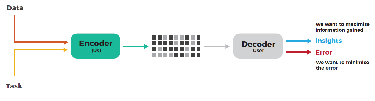
Effective data visualization minimizes user error while maximizing the information conveyed.
Insights: use all the tools available and our knowledge about our visual perceptions to communicate
Minimize error: avoid misleading conclusions
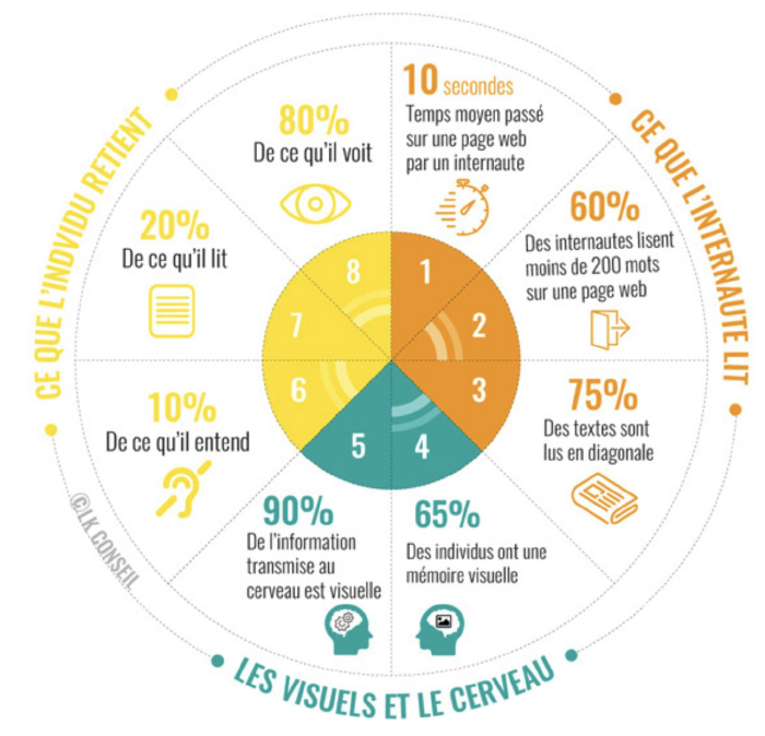
Data visualizations are what people REMEMBER.
It is part of your role to render nice visualizations as they may be what people will remember of your work.
Important part of the job of [anyone working with data]
May seem simple but lots of threats hinder good data viz !
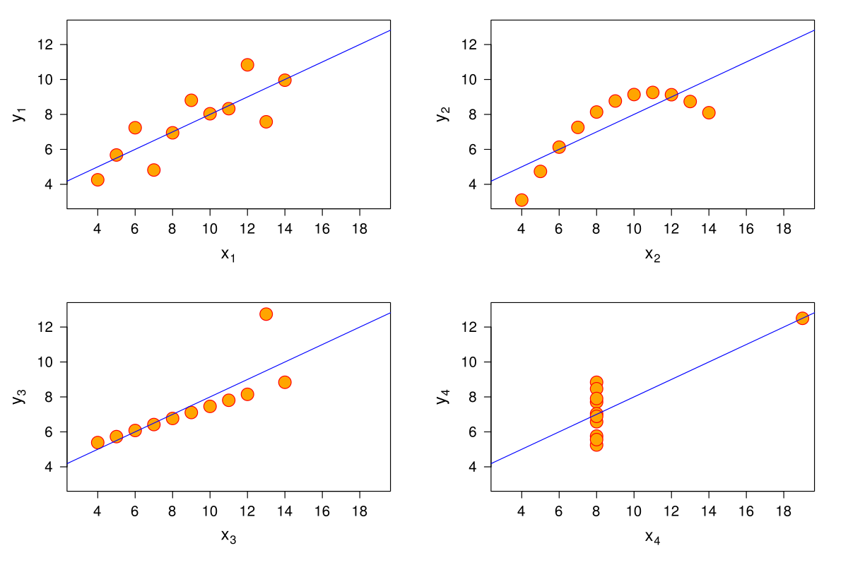
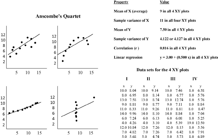
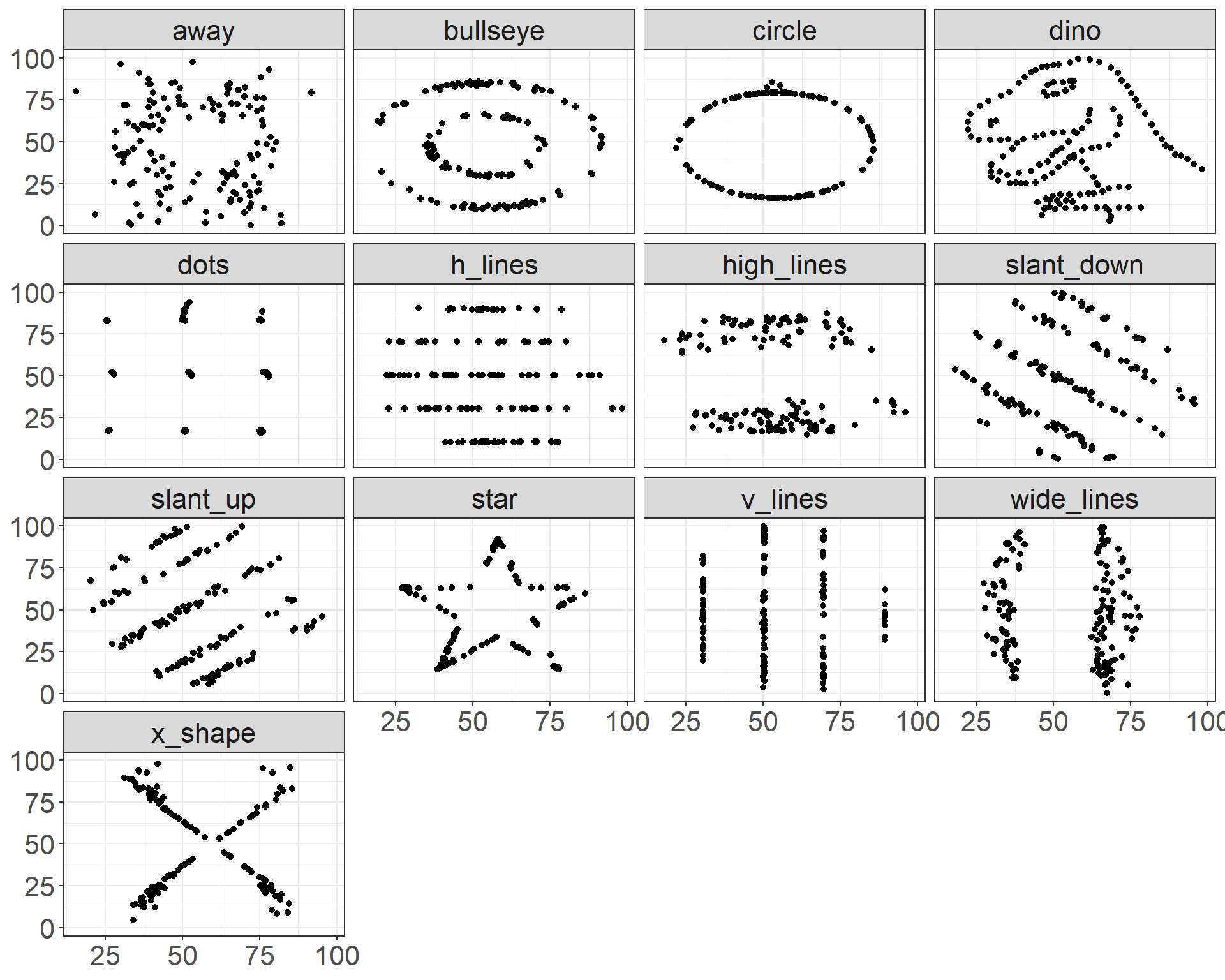
Anscombe Quartet, level up
| dataset | mean_x | mean_y | var_x | var_y | cor_xy |
|---|---|---|---|---|---|
| dino | 54 | 48 | 281 | 726 | -0.06 |
| away | 54 | 48 | 281 | 726 | -0.06 |
| h_lines | 54 | 48 | 281 | 726 | -0.06 |
| v_lines | 54 | 48 | 281 | 726 | -0.07 |
| x_shape | 54 | 48 | 281 | 725 | -0.07 |
| star | 54 | 48 | 281 | 725 | -0.06 |
| high_lines | 54 | 48 | 281 | 726 | -0.07 |
| dots | 54 | 48 | 281 | 725 | -0.06 |
| circle | 54 | 48 | 281 | 725 | -0.07 |
| bullseye | 54 | 48 | 281 | 726 | -0.07 |
| slant_up | 54 | 48 | 281 | 726 | -0.07 |
| slant_down | 54 | 48 | 281 | 726 | -0.07 |
| wide_lines | 54 | 48 | 281 | 726 | -0.07 |
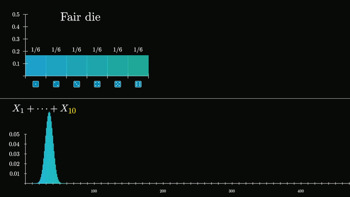
3Blue1Brown: But what is the central limit theorem ?
Visualization Analysis and Design. Tamara Munzner, with illustrations by Eamonn Maguire. A K Peters Visualization Series, CRC Press, 2014.
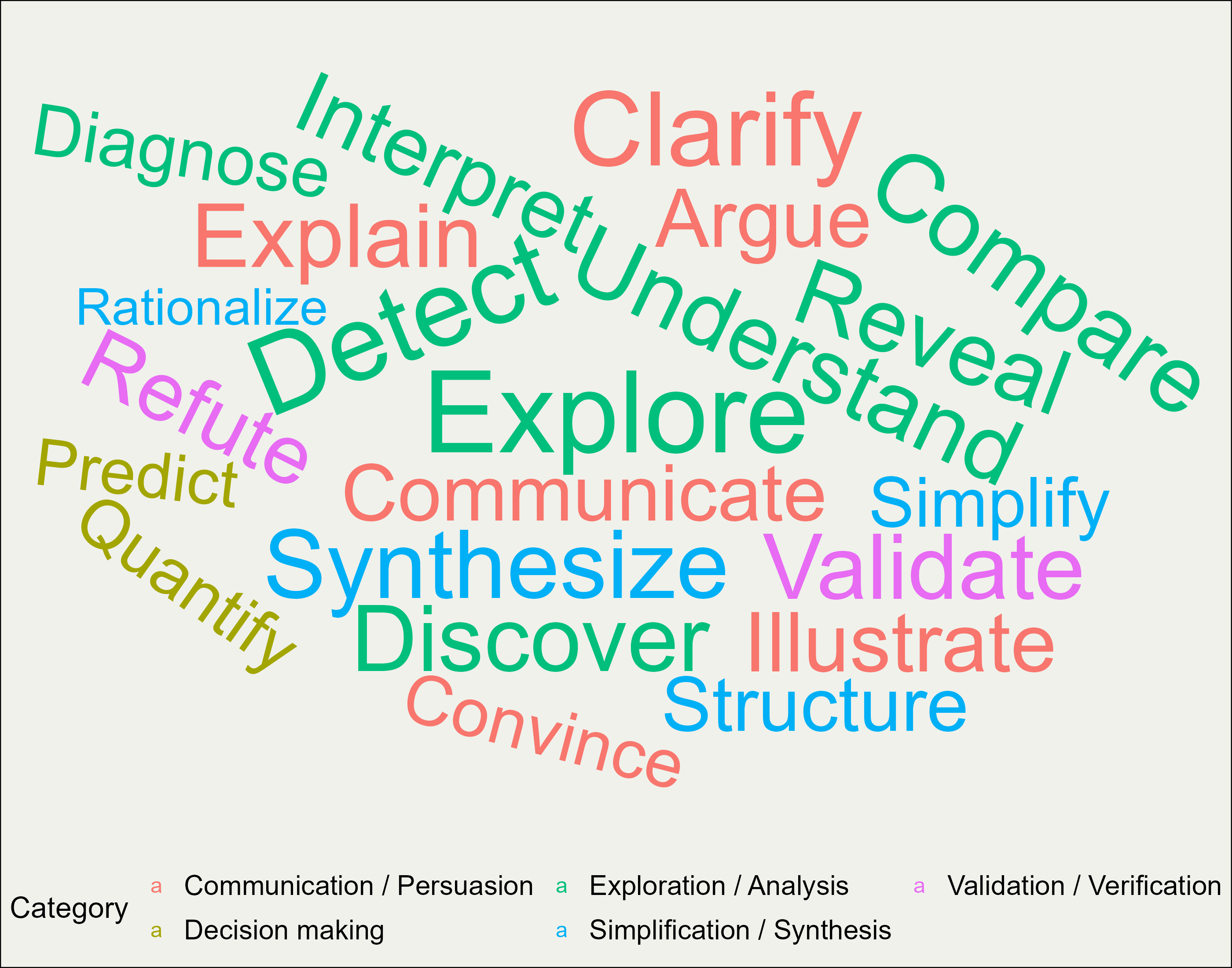
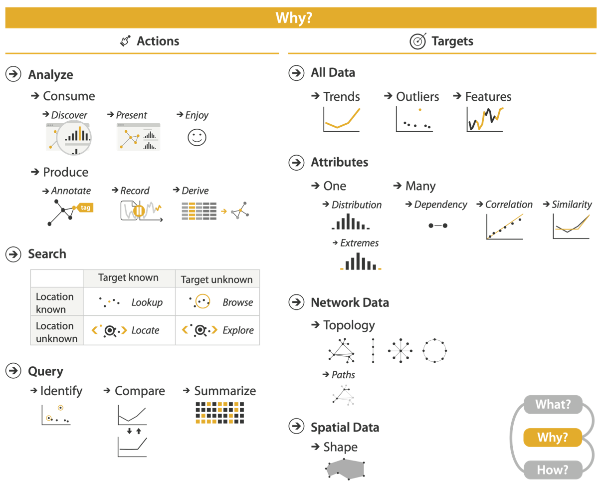
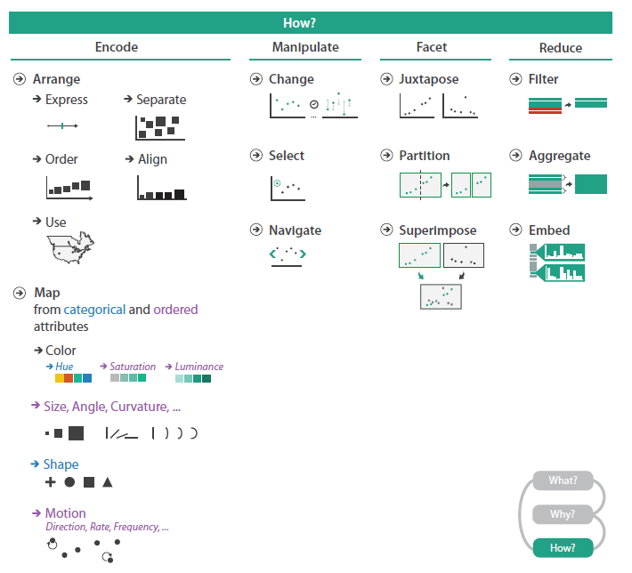
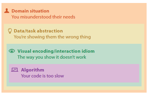
{action ; target}
Compare trends
Derive attribute(s)
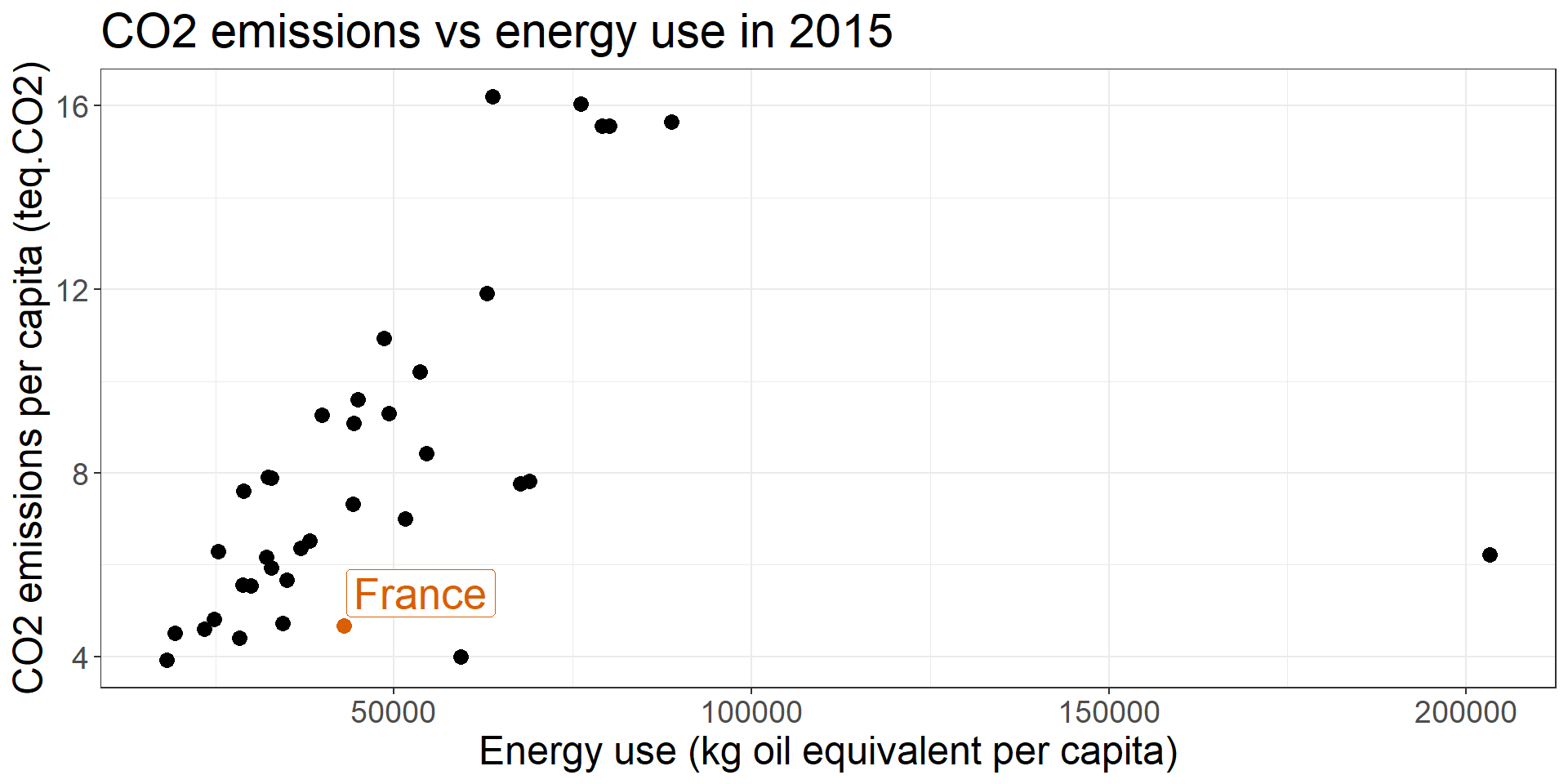
Explore correlations/relationships
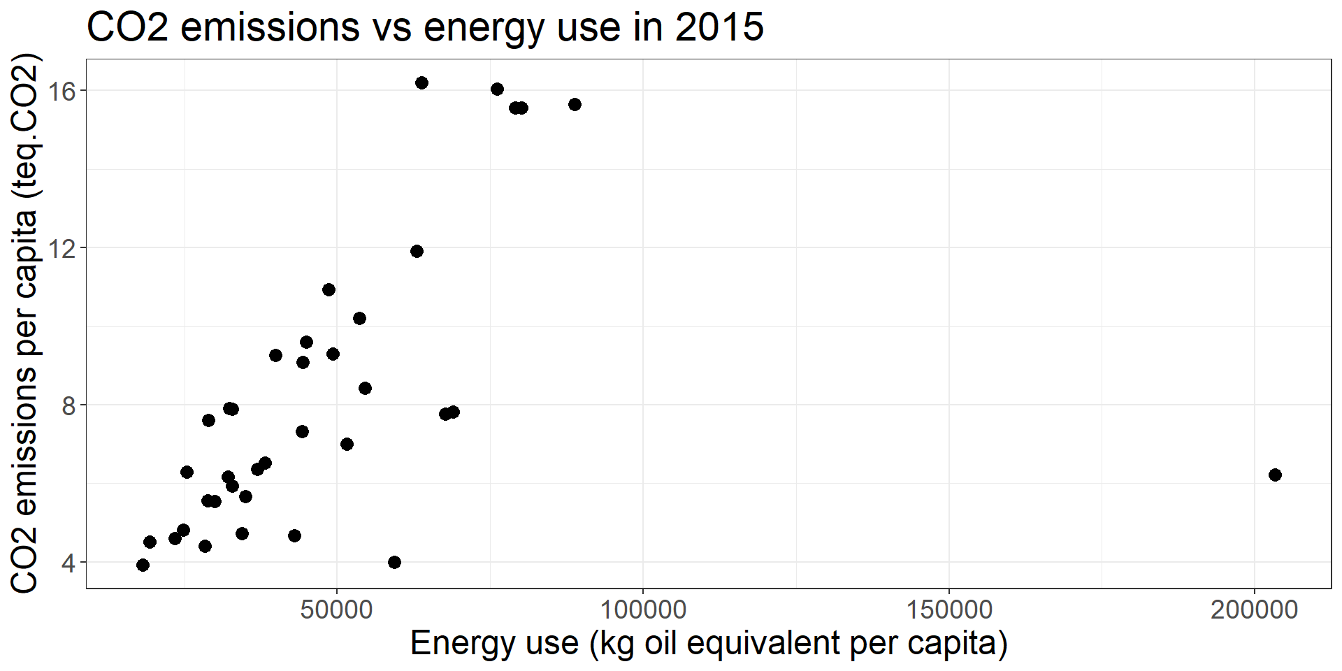
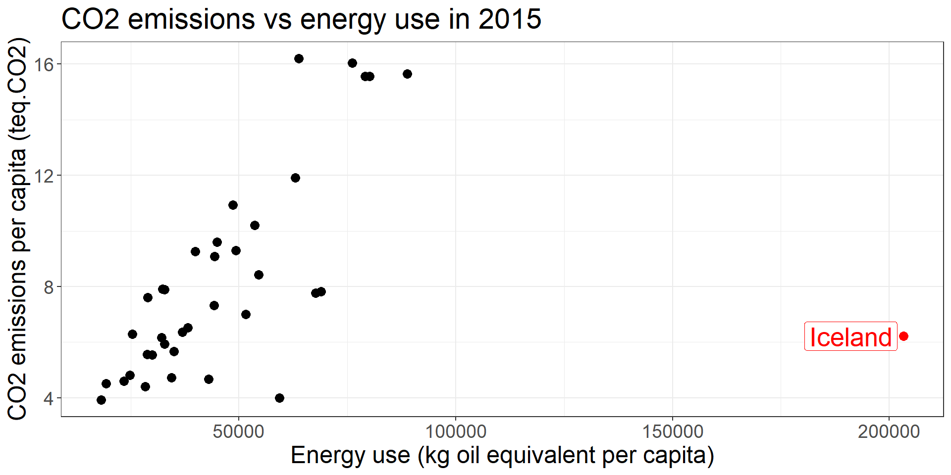
Identify outlier(s)/atypic obs
Visualization Analysis and Design. Tamara Munzner, with illustrations by Eamonn Maguire. A K Peters Visualization Series, CRC Press, 2014.
https://www.interaction-design.org/literature/article/stage-1-in-the-design-thinking-process-empathise-with-your-users
Many idiom options
(we’re not going to cover each of the graph)
These remain IDEAS / PROPOSALS, it’s your role to ADAPT yourself to the context / goal of the dataviz.
Visualization Analysis and Design. Tamara Munzner, with illustrations by Eamonn Maguire. A K Peters Visualization Series, CRC Press, 2014.
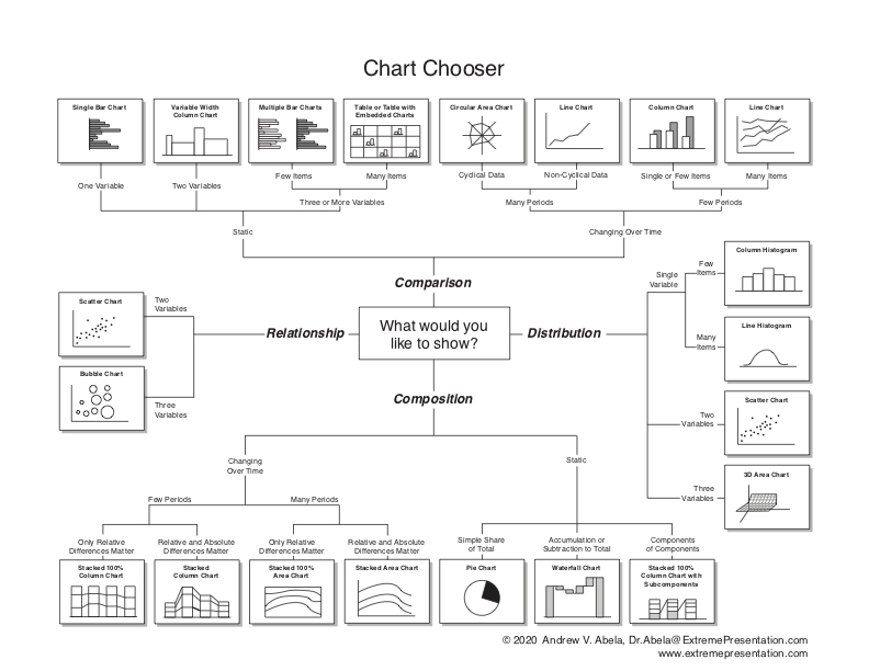
How to choose among all these possibilities ?


Anne Treisman - National Medal of Science, 2011.webm, Domaine public, https://commons.wikimedia.org/w/index.php?curid=125273433
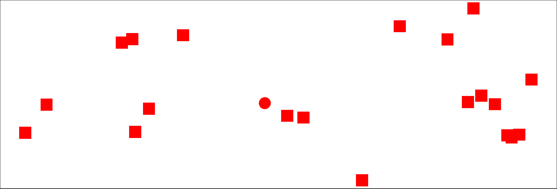
An example (inspired from Storytelling with data, Cole Nussbaum): count the number of 4s

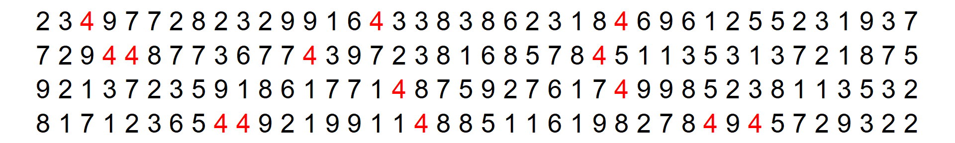
Knaflic, Cole. Storytelling With Data: A Data Visualization Guide for Business Professionals, Wiley, © 2015.
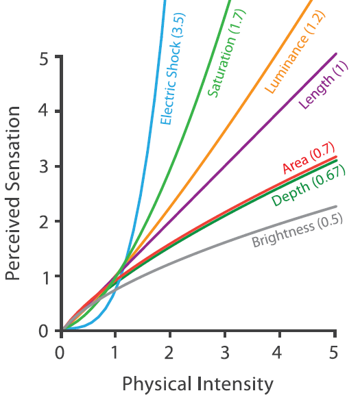
1: Thorpe et al., 1996 (https://doi.org/10.1038/381520a0)
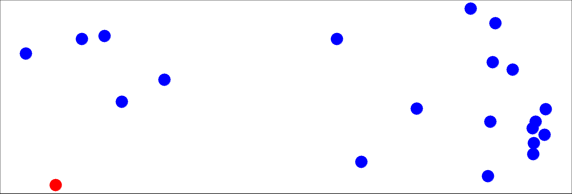
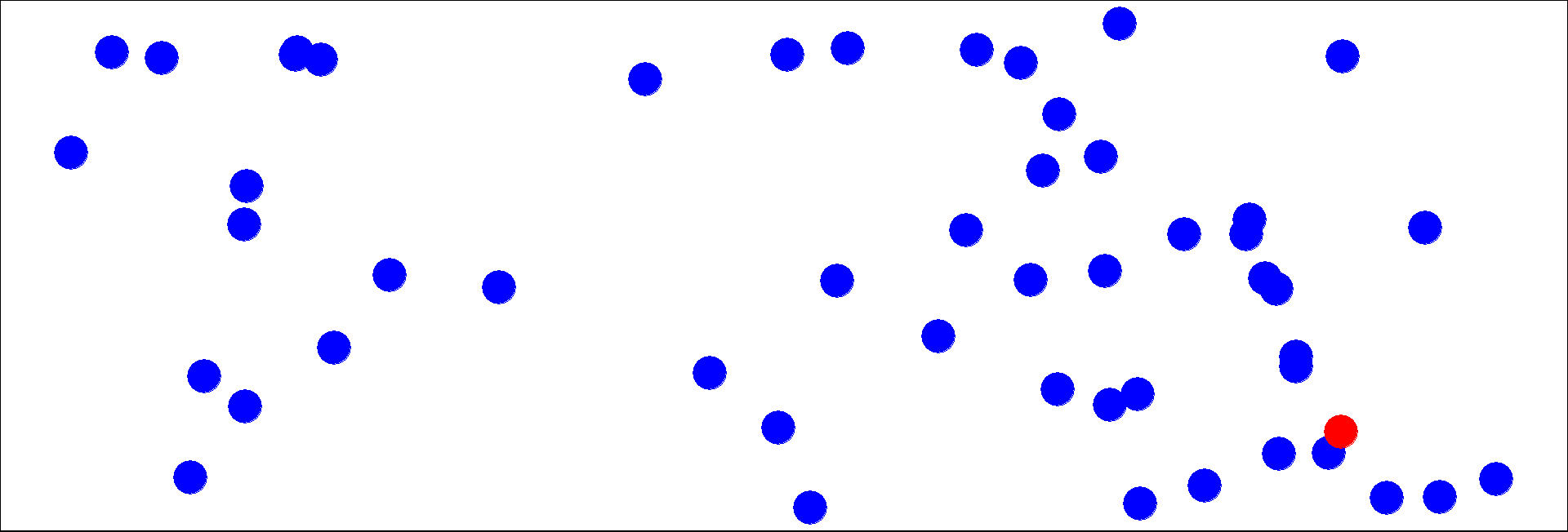
Locate the red dot.
\(n=20\)
\(n=50\)
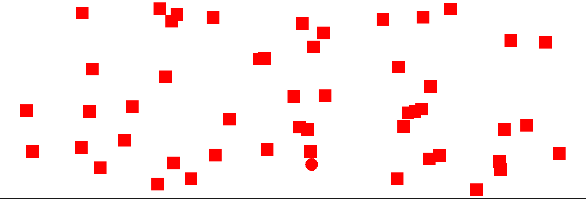
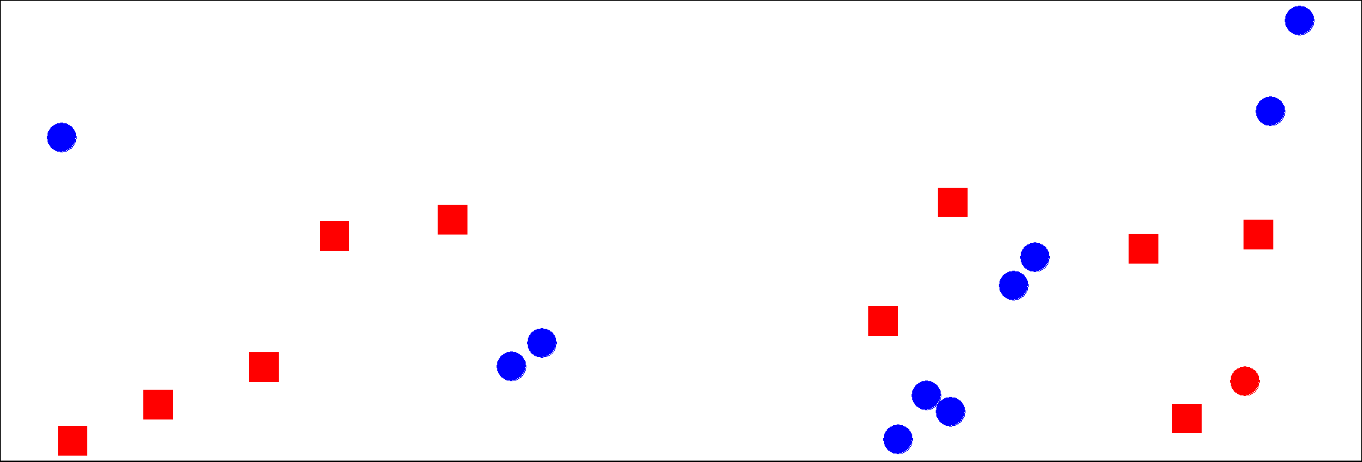
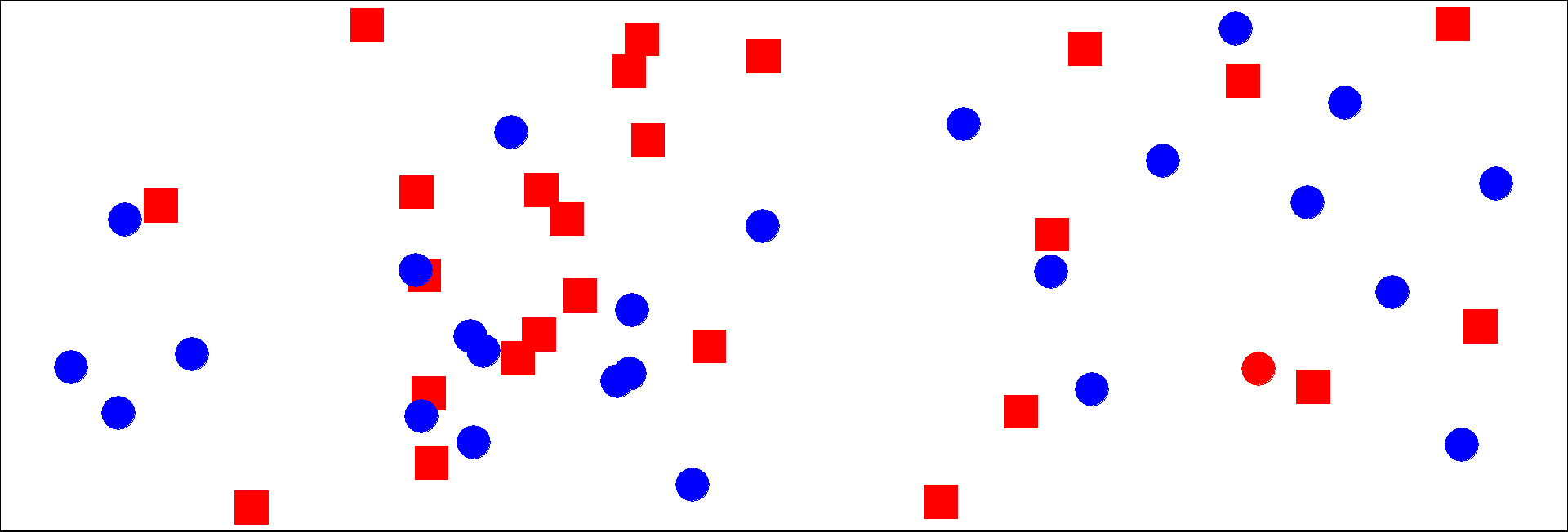
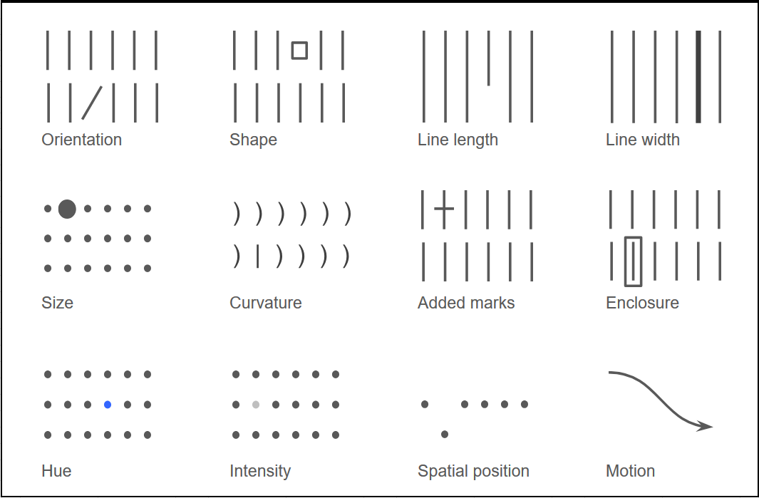
Other channels have the ability to provide a popout effect
Visualization Analysis and Design. Tamara Munzner, with illustrations by Eamonn Maguire. A K Peters Visualization Series, CRC Press, 2014.
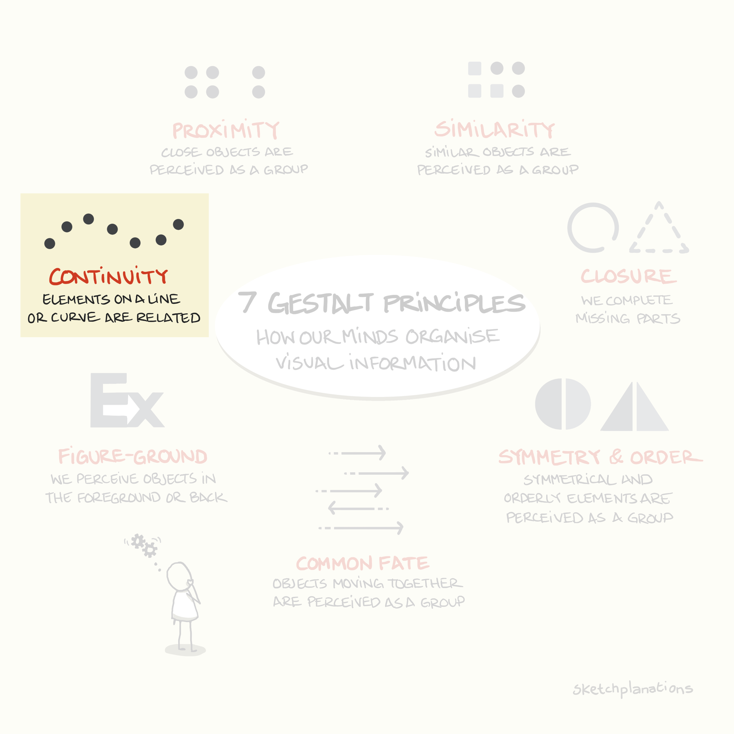
Gestalt laws of Perception: our brain makes a lot of shortcuts !
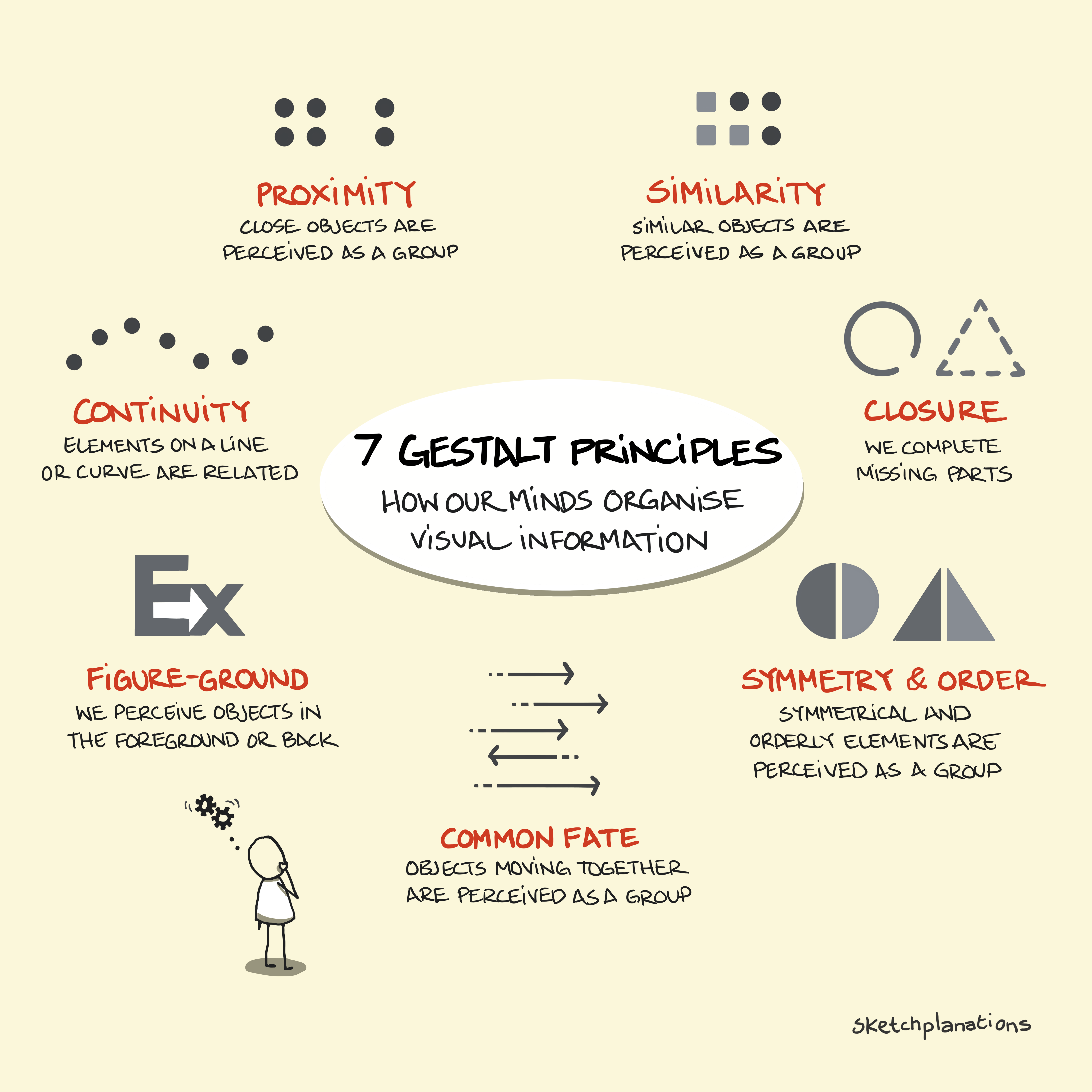
https://sketchplanations.com/gestalt-principles
Which one do you prefer ?
:::
Leverage the principles of our visual system to communicate your message(s) as clearly and effectively as possible.


https://www.interaction-design.org/literature/article/stage-1-in-the-design-thinking-process-empathise-with-your-users
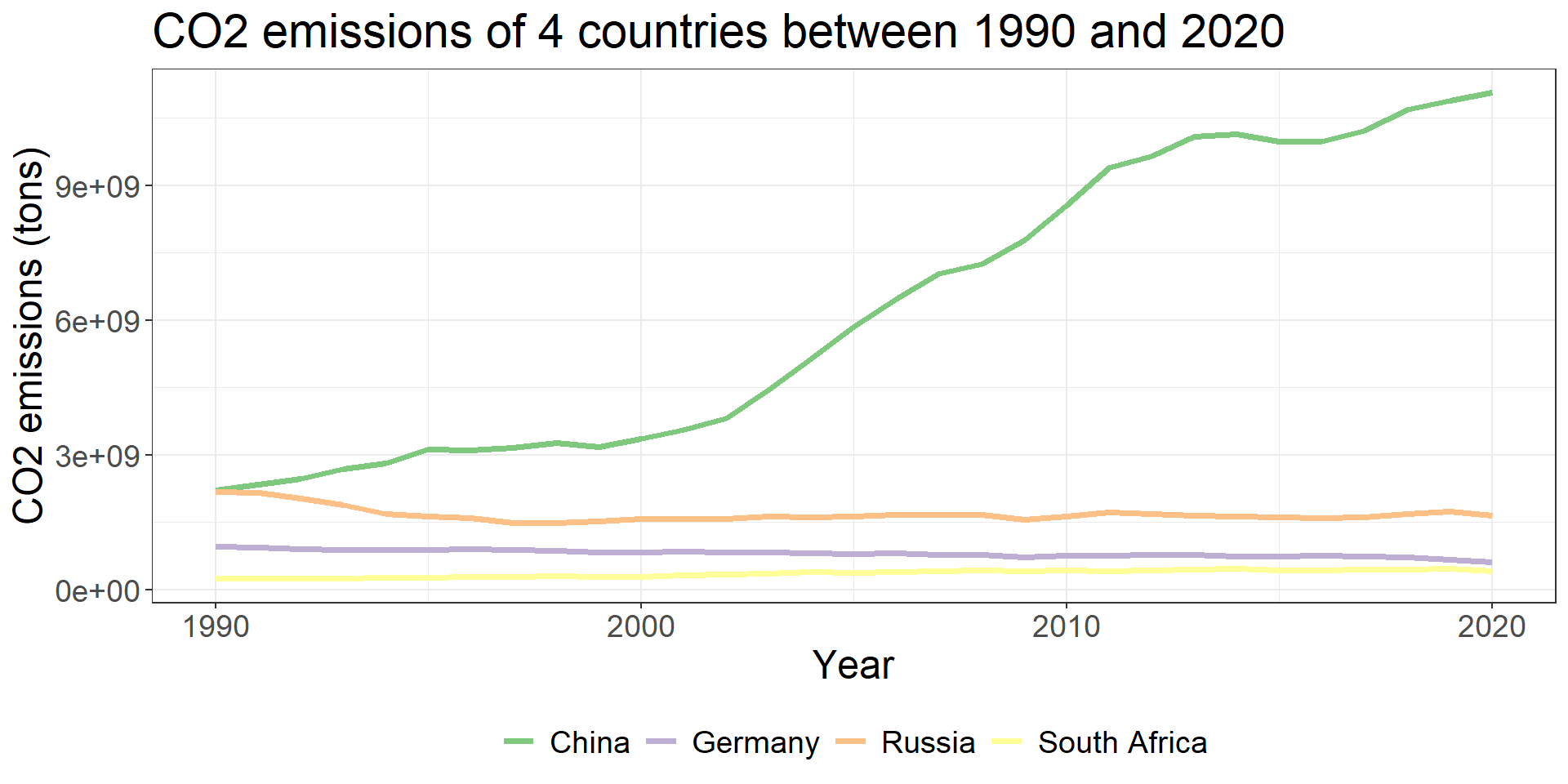
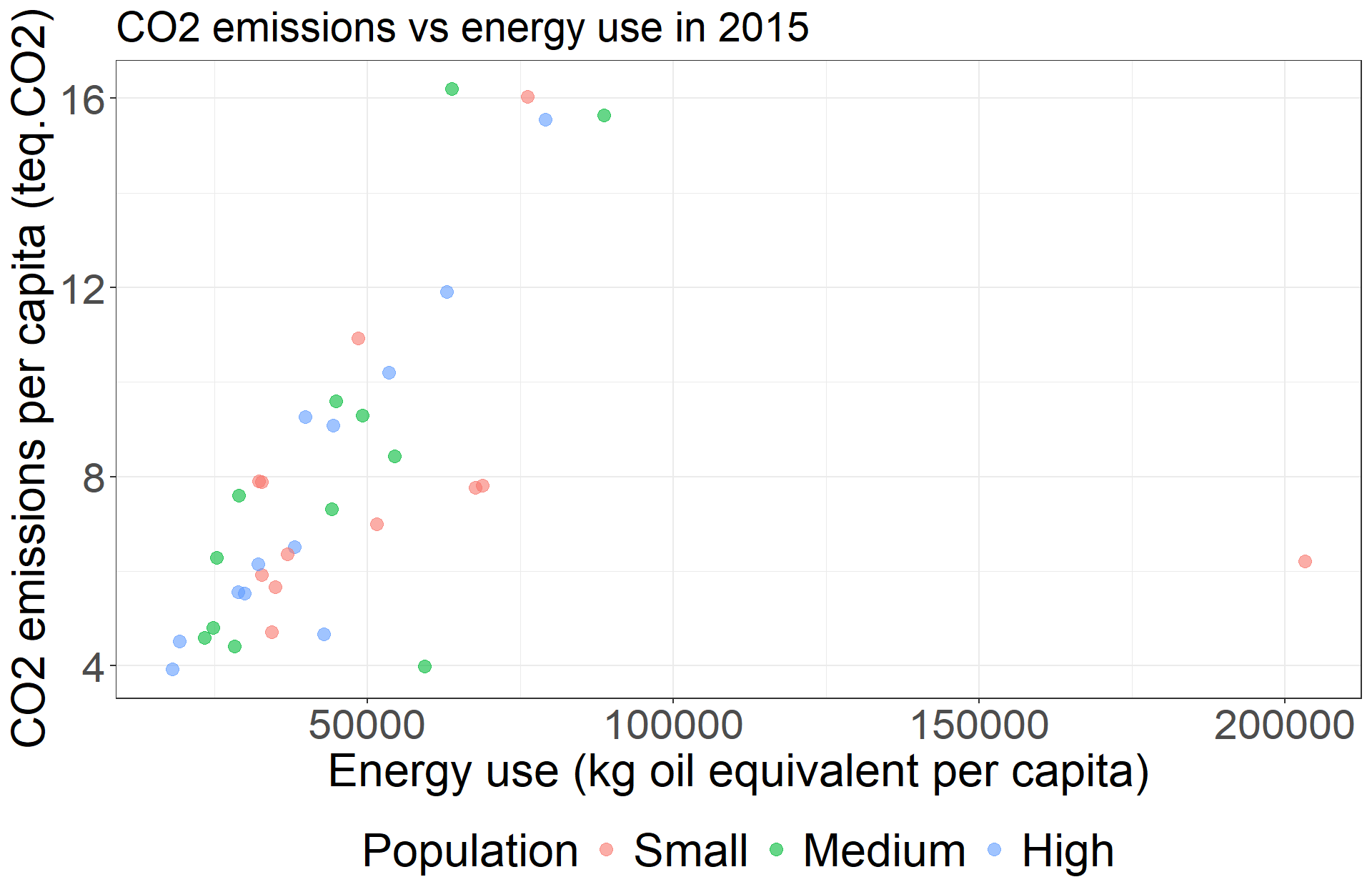
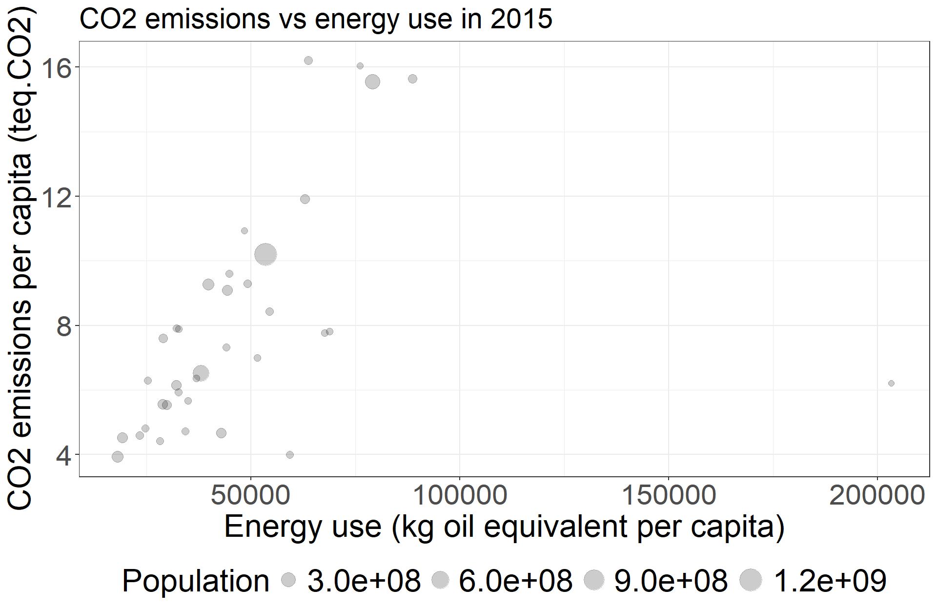
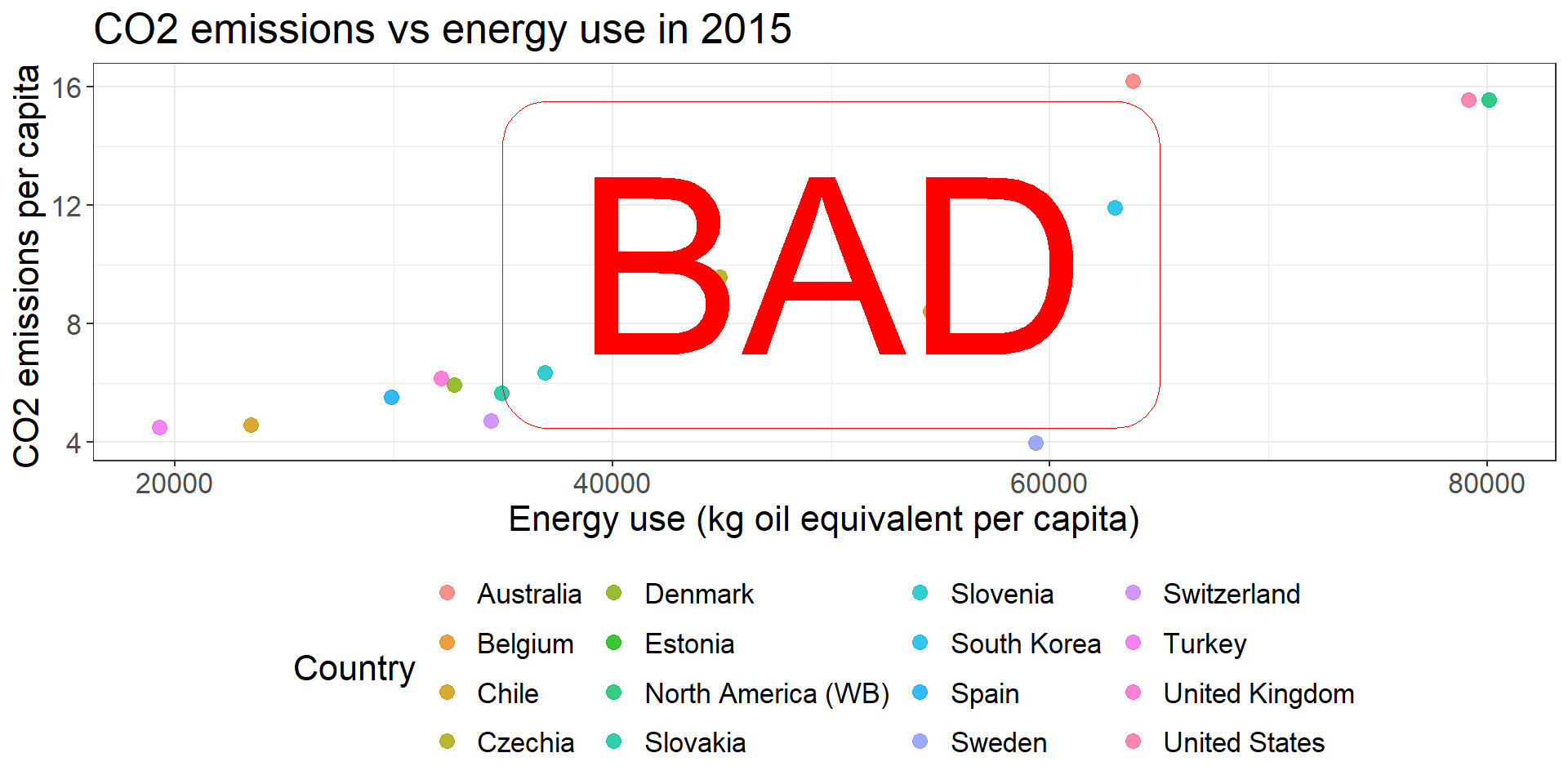
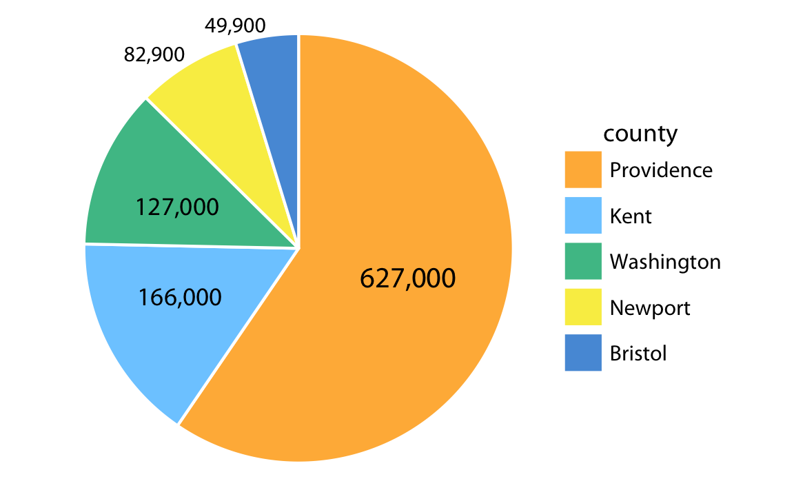
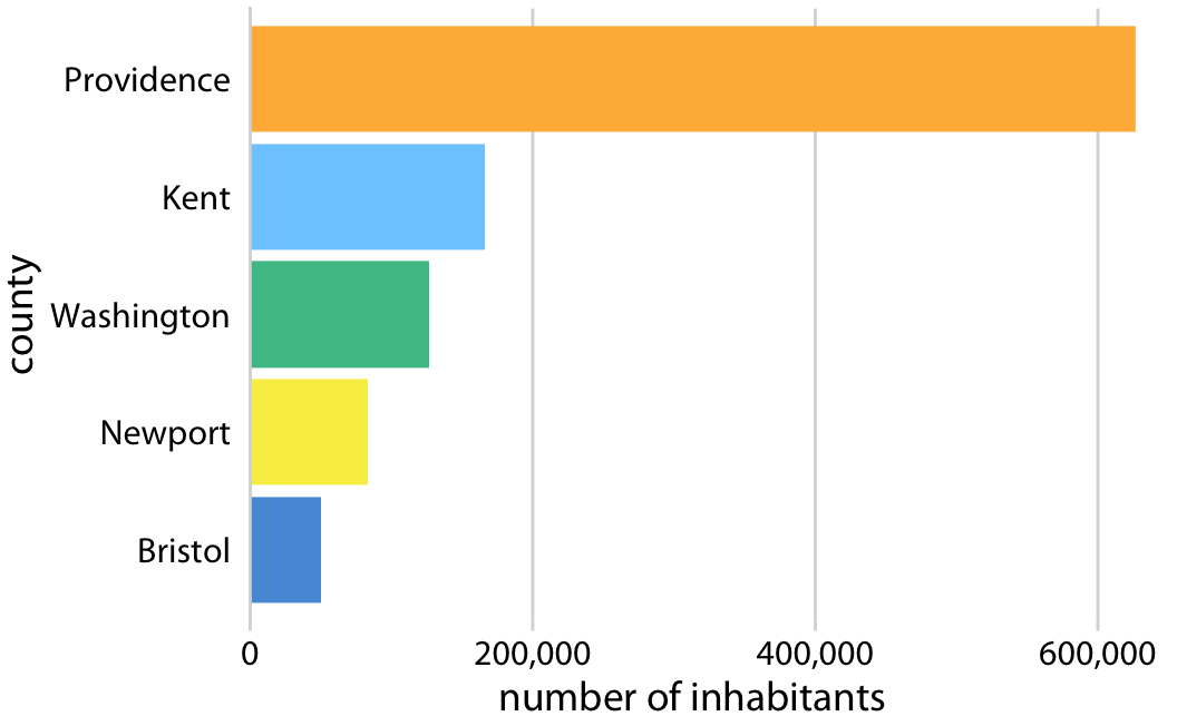
The principle of proportional ink: The sizes of shaded areas in a visualization need to be proportional to the data values they represent, Claus Wilke Fundamentals of data visualisation
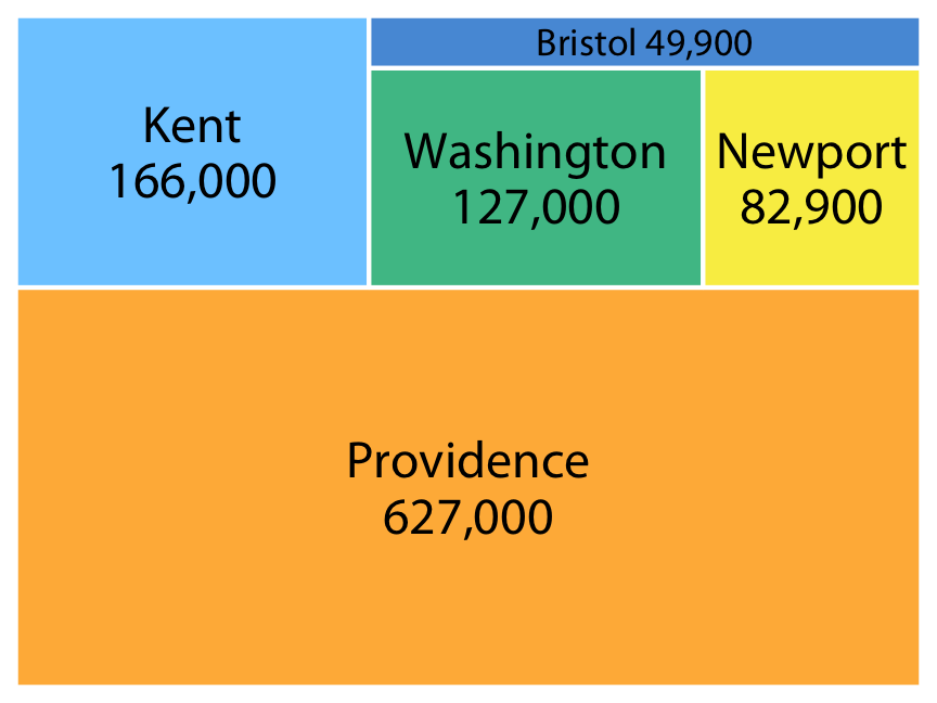
Fundamentals of data visualization. Claus Wilke
Take home message:
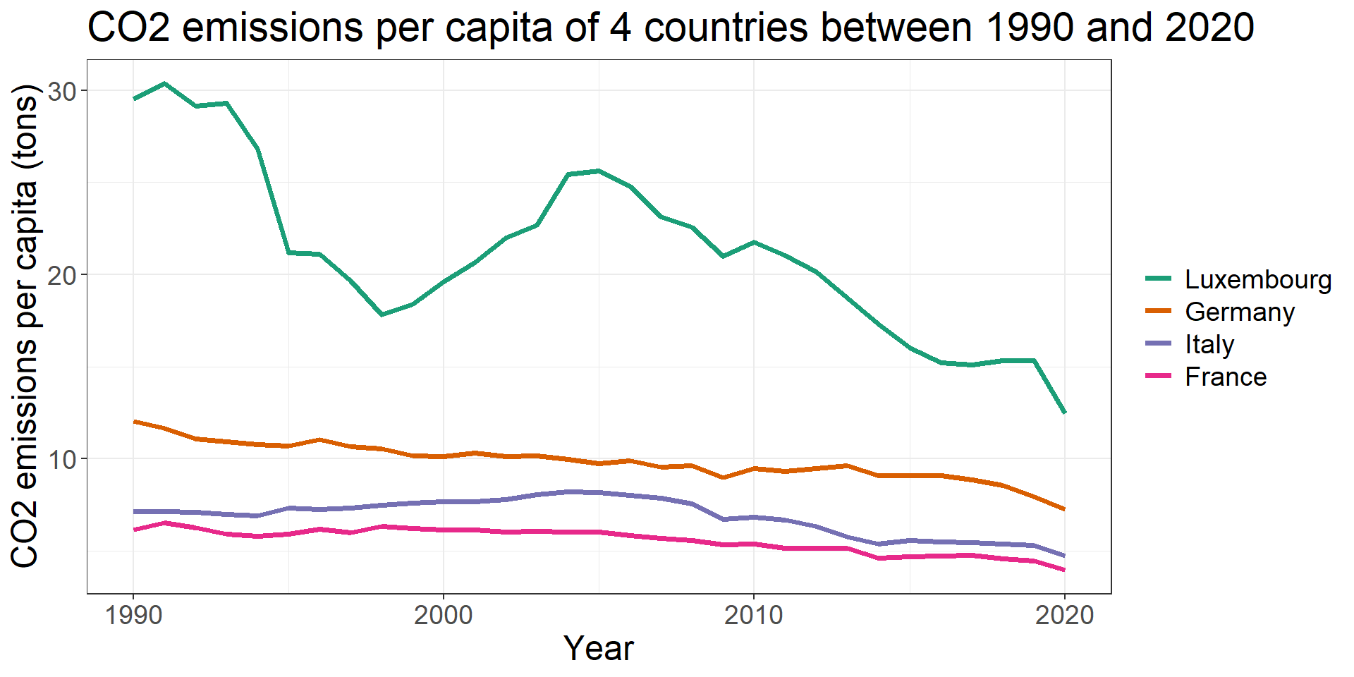
\(\Rightarrow\) When possible, prefer bars to pies / squares.
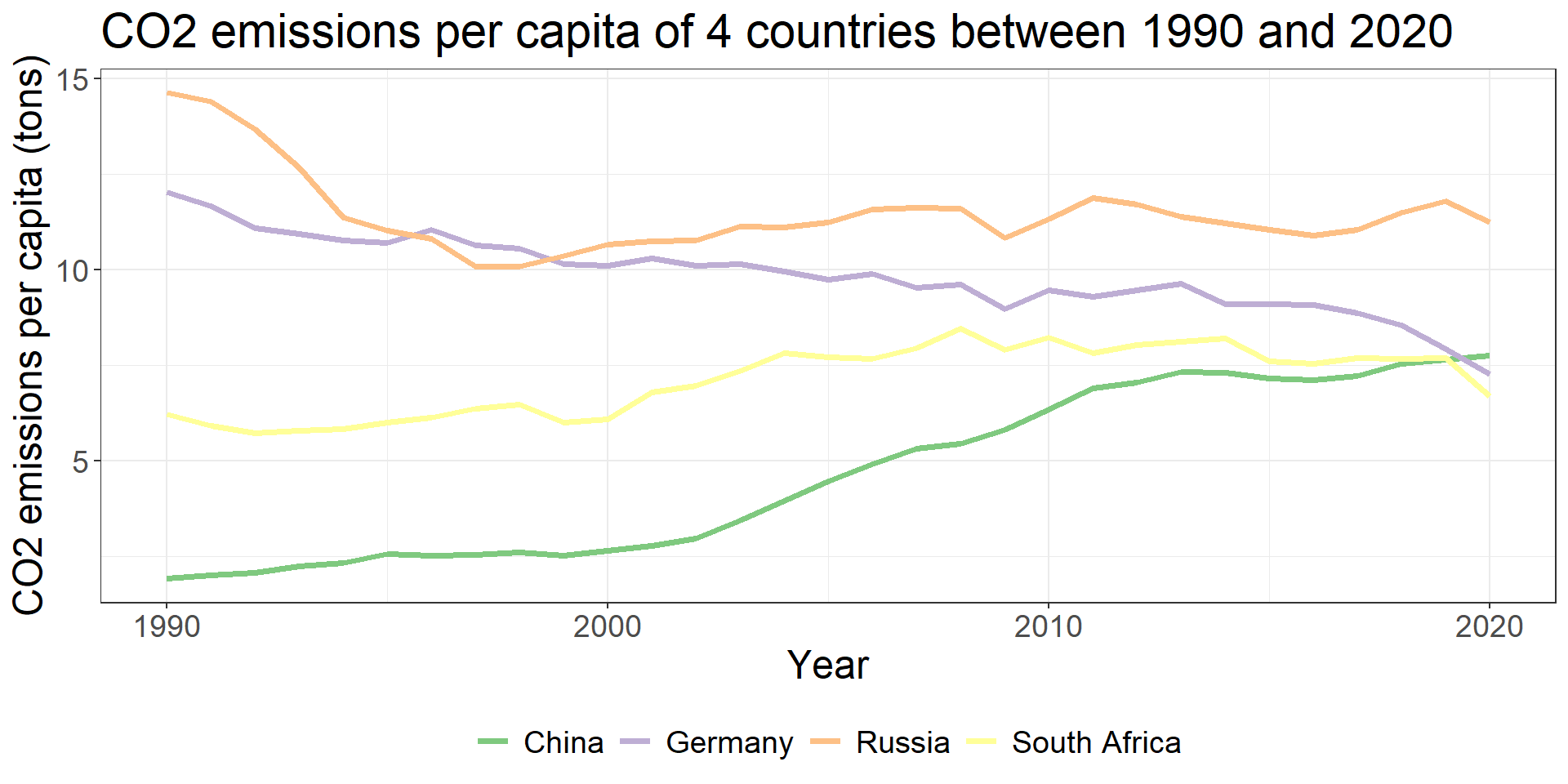
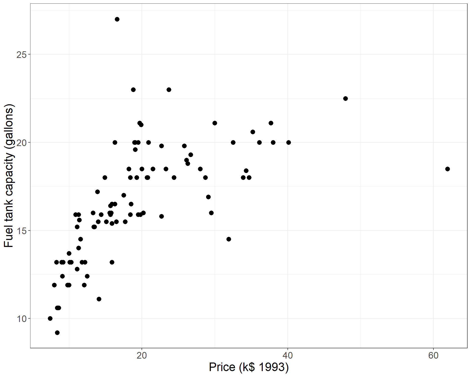
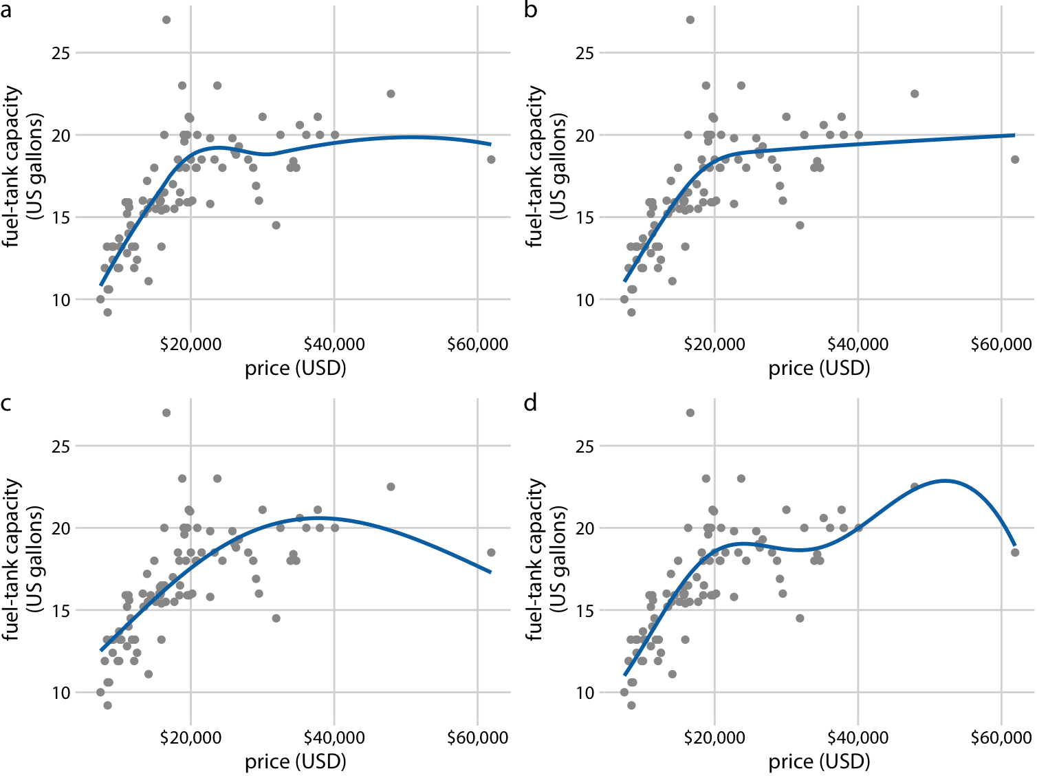
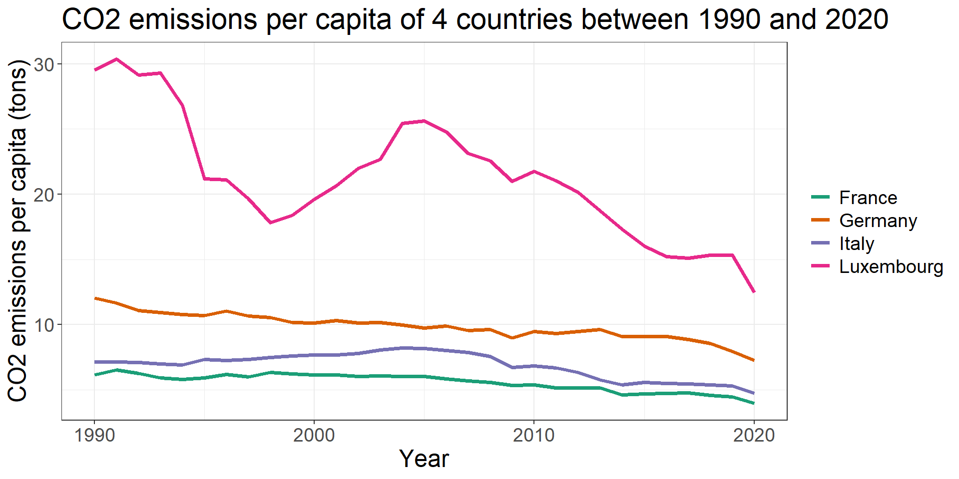
Consider a scatterplot / time-serie plot
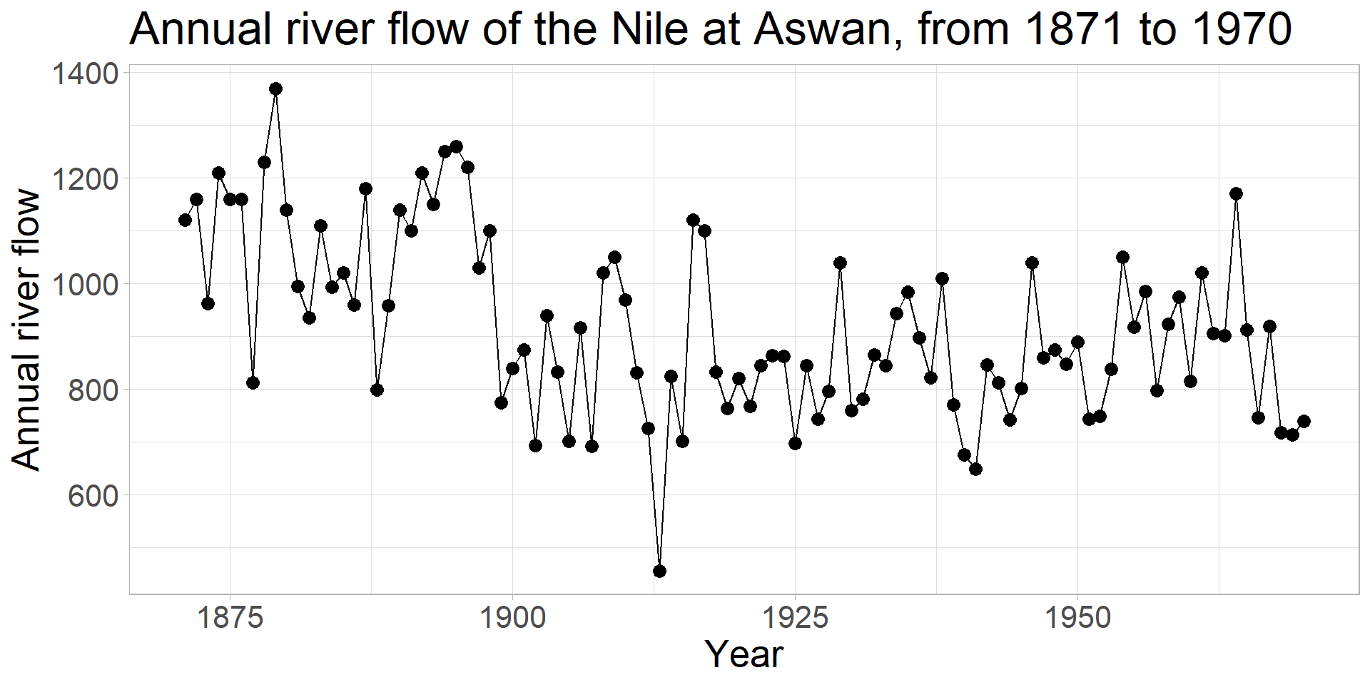
Common tool: curve of tendency
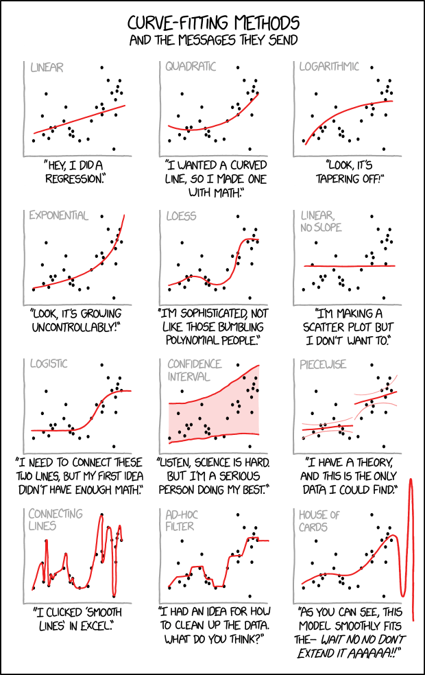
https://xkcd.com/2048/
What do you think of this ?
And these fits ?
Fundamentals of data visualization. Claus Wilke
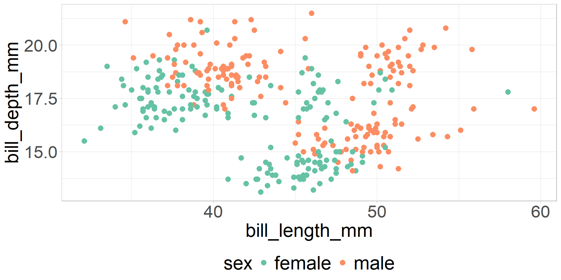
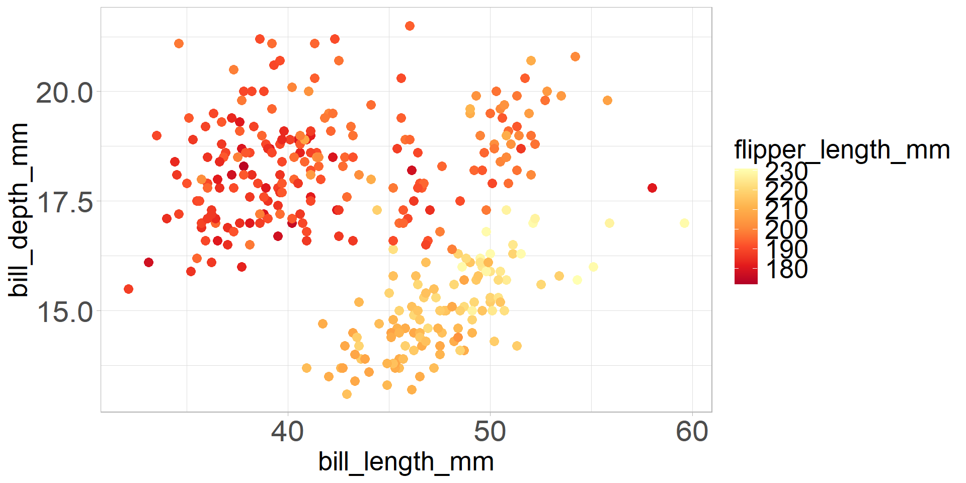
Color is one of the most expressive and effective channel
But have to be used carefully !
First question on the attribute : what do I want to show with the color ?
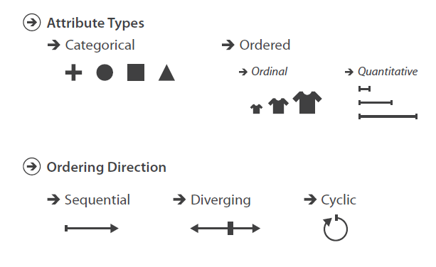
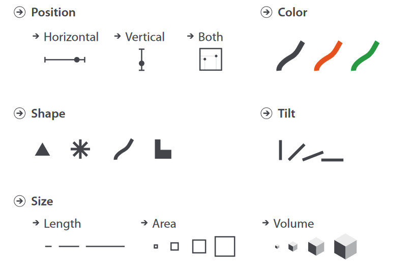
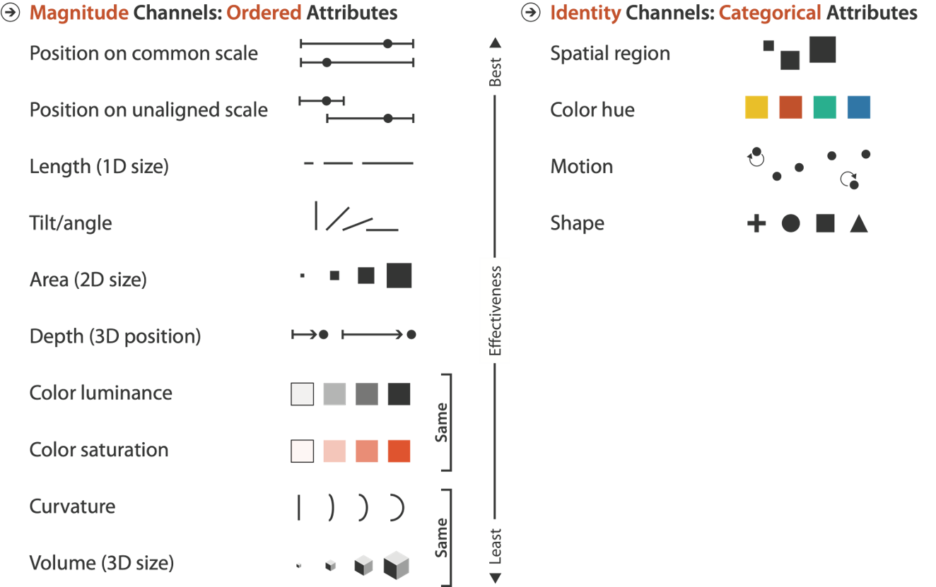
Recall: attribute types
In a nutshell
Categorical attributes (gender / Main hobby etc.)
Ordered attributes
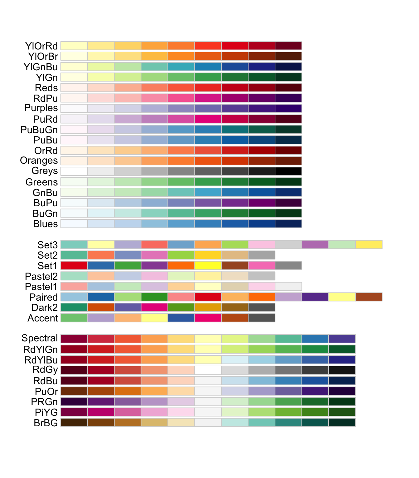
Ordered attributes can be split into i) Sequential ii) diverging iii) cyclic attributes
Distinguish
Scale / Compare
Point out
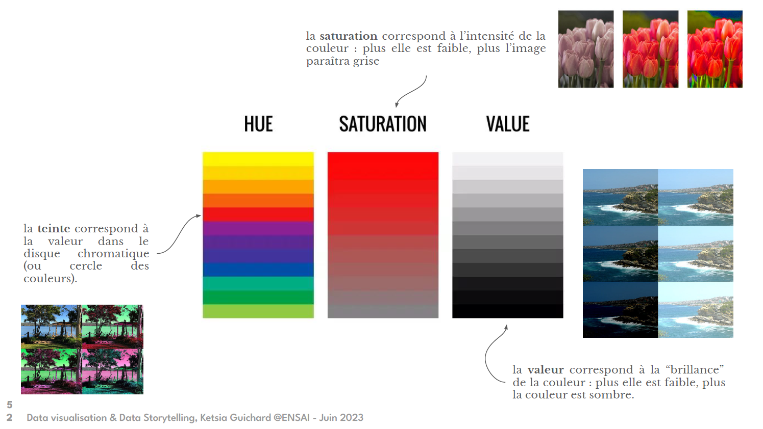
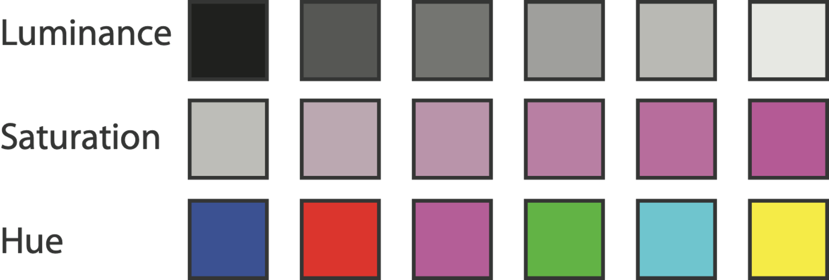
Color = f(Luminance / Saturation / Hue) = 3 channels
Visualization Analysis and Design. Tamara Munzner, with illustrations by Eamonn Maguire. A K Peters Visualization Series, CRC Press, 2014.
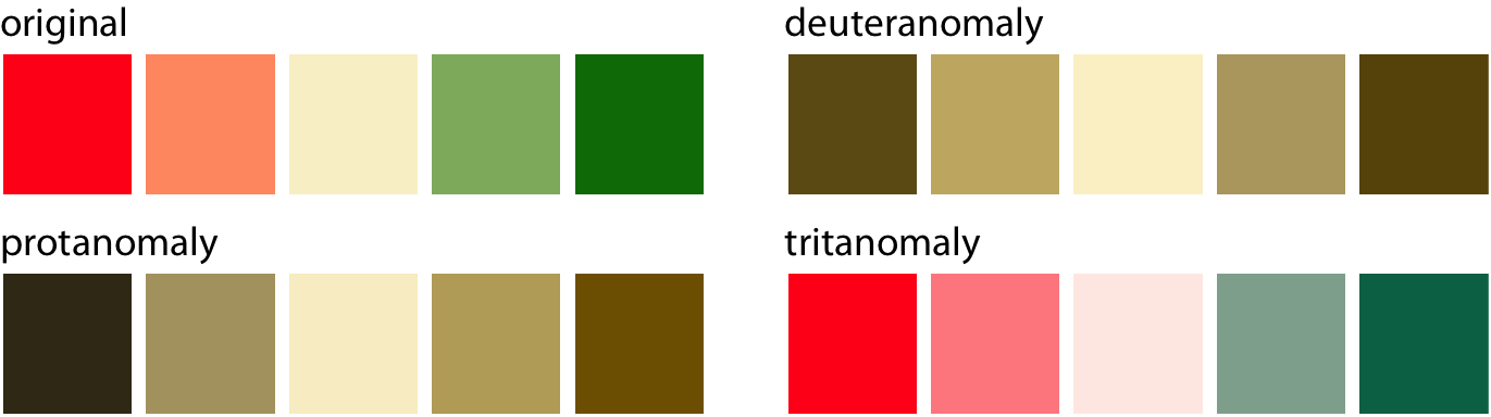
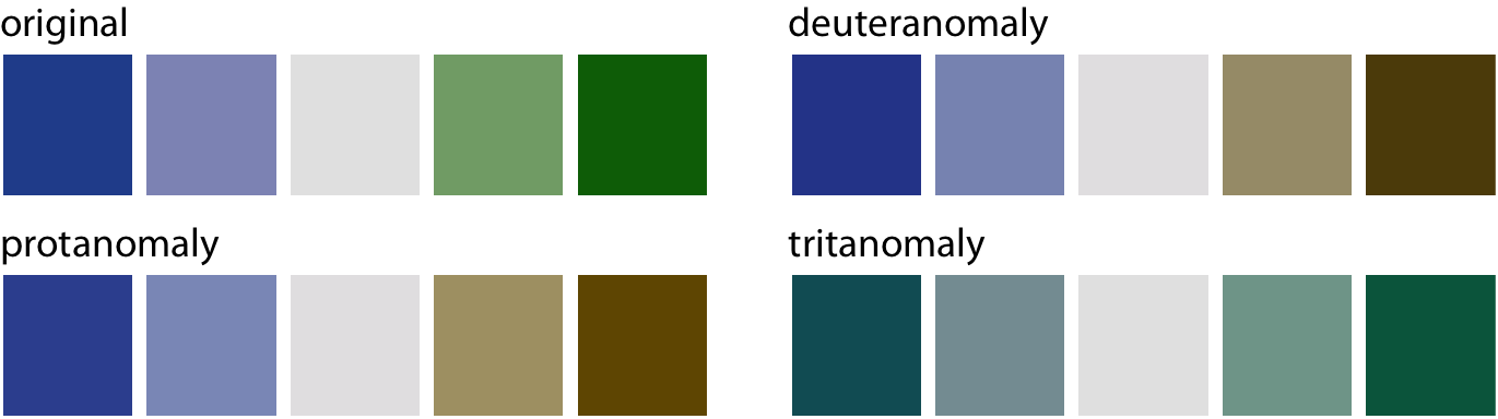
8% of the men have a color vision deficiency (cvd) !
“Only” 0.5% of the women
Supposing 4% (average) of the people have cvd, what is the probability that no one has cvd among a group of 50 people ?
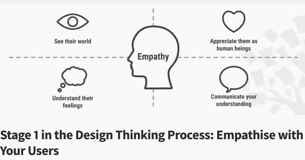
How to understand their point of view
Fundamentals of data visualization. Claus Wilke
How to take care:
RColorBrewer::display.brewer.all(colorblindFriendly = TRUE)
Other palettes proposed by David Nichols
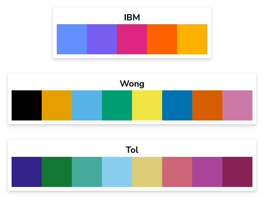
Above all: test your graph with a cvd simulator (https://www.color-blindness.com/coblis-color-blindness-simulator/) !
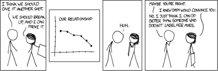
“If you take away only one single lesson from this book, make it this one: Pay attention to your axis labels, axis tick labels, and other assorted plot annotations. Chances are they are too small. In my experience, nearly all plot libraries and graphing softwares have poor defaults. If you use the default values, you’re almost certainly making a poor choice.”, Claus Wilke Fundamentals of data visualisation
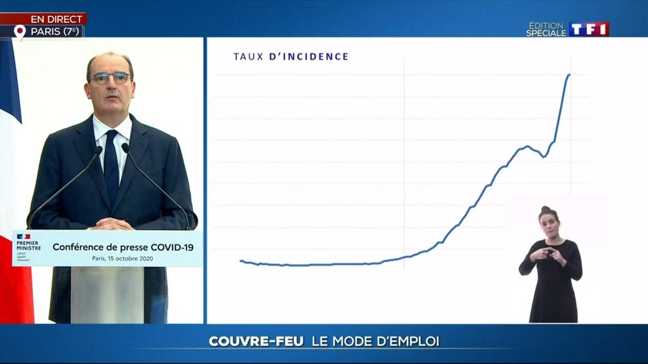
https://xkcd.com/833/
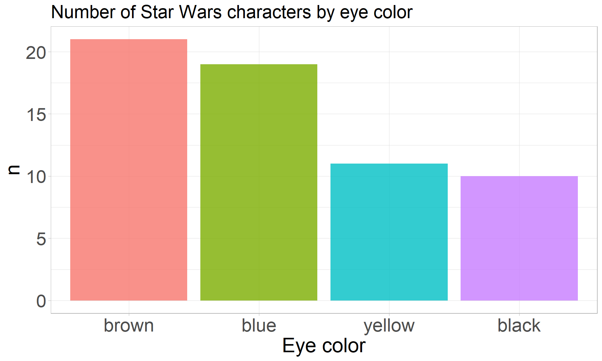
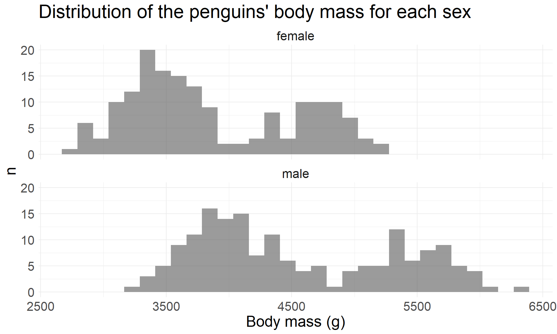
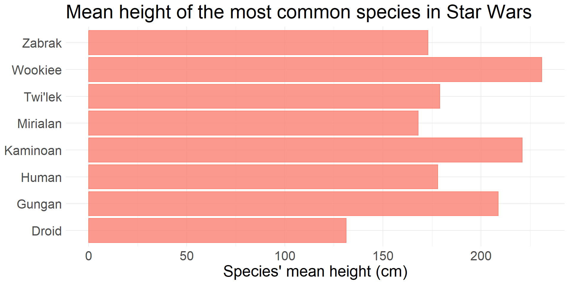
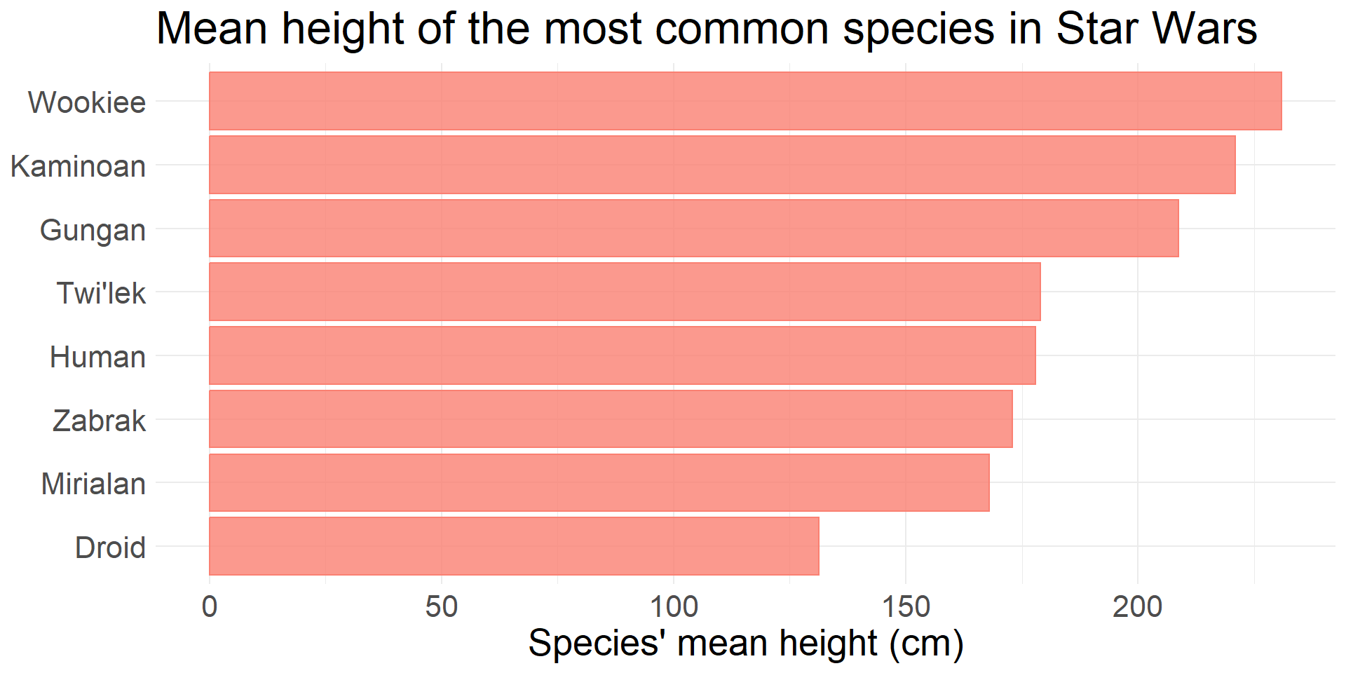
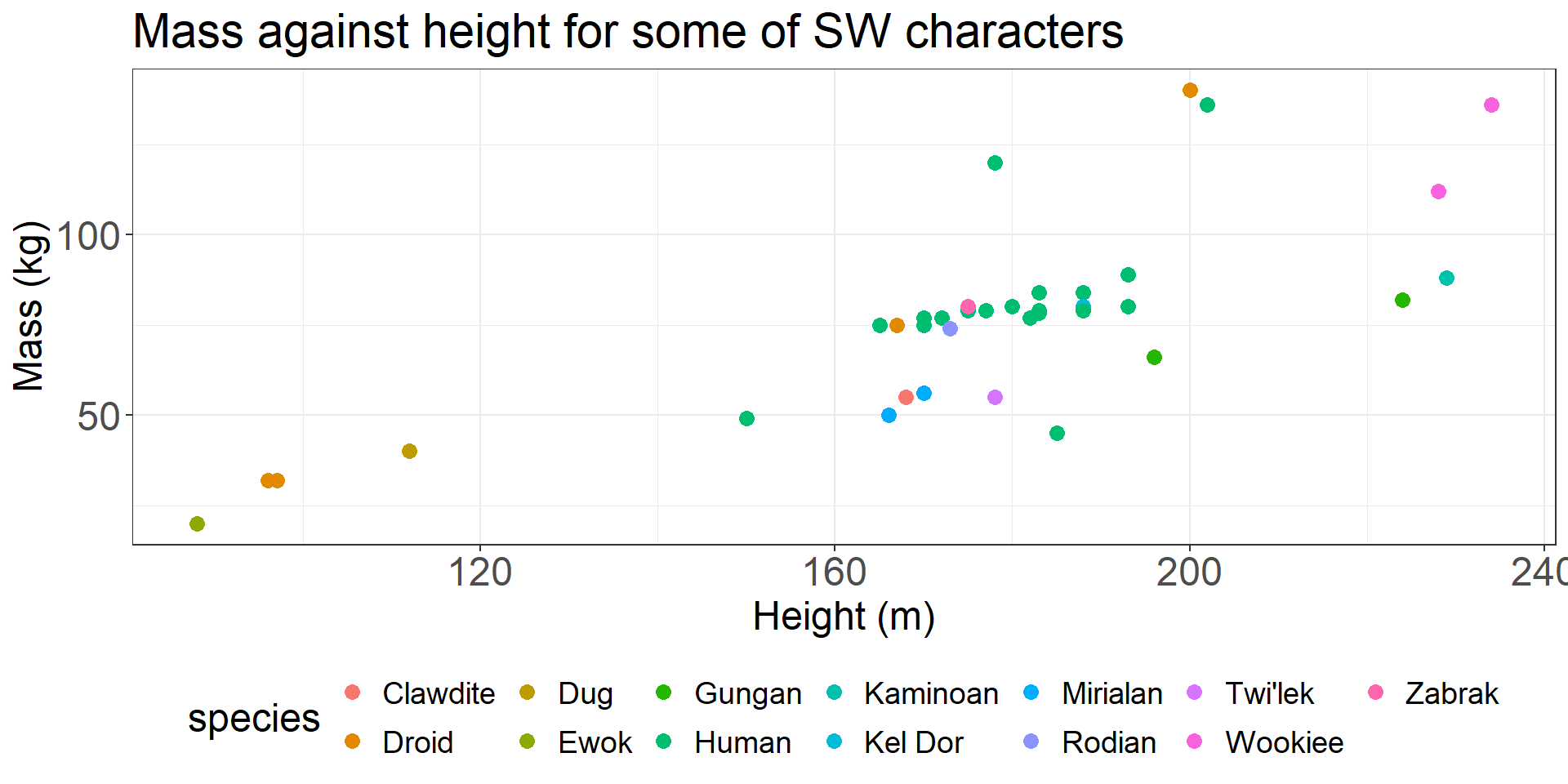
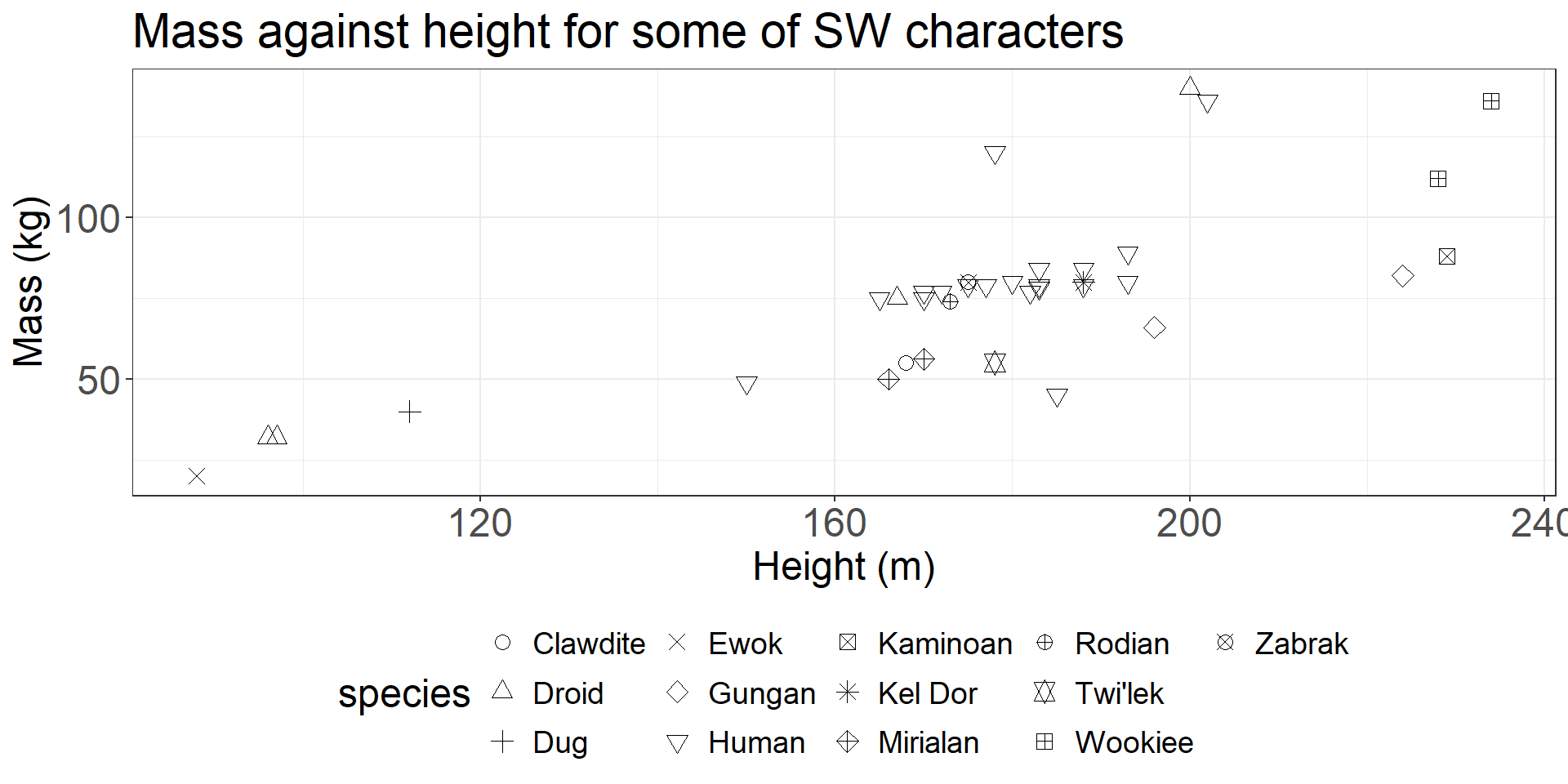
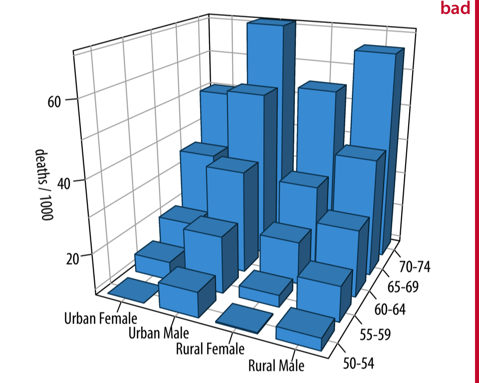
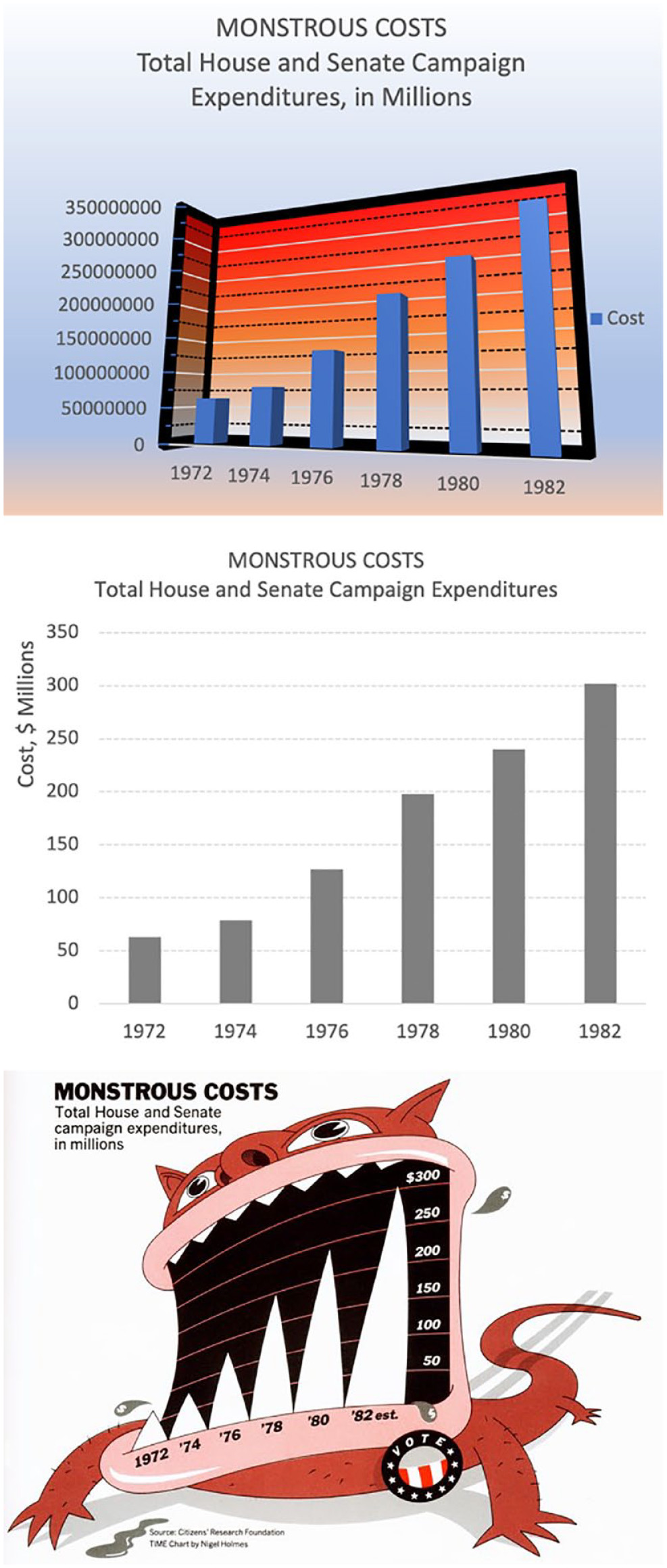
Avoid
Avoid
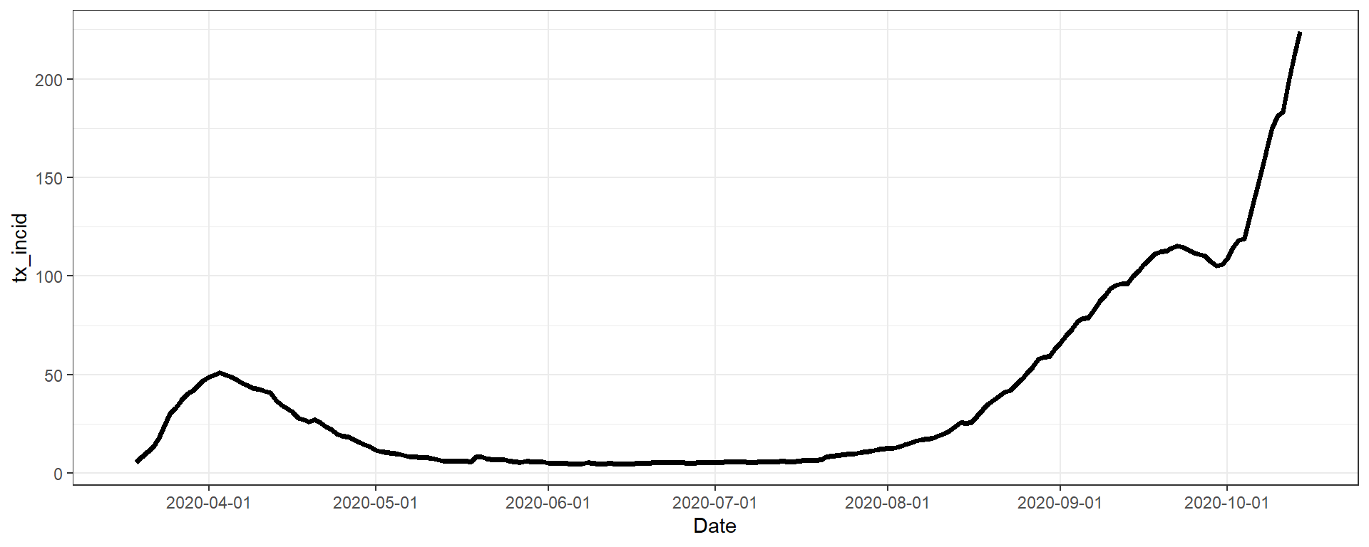
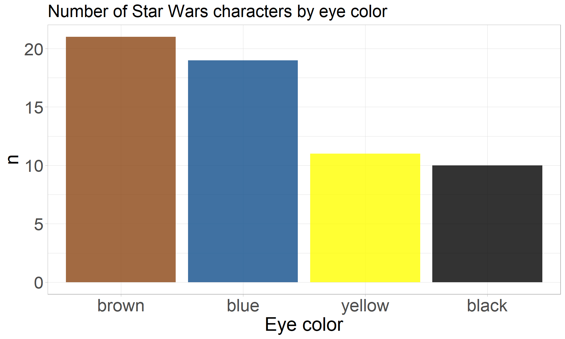
Prefer:
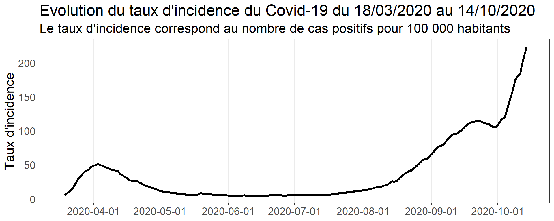
Or:
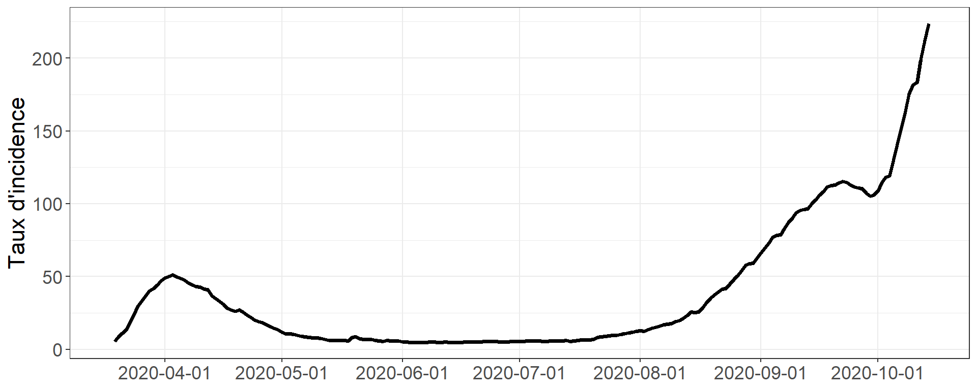
Help the viewer
Avoid
Prefer
Fundamentals of data visualization. Claus Wilke
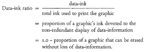
E.R. Tufte, The Visual Display of Quantitative Information
Within reason
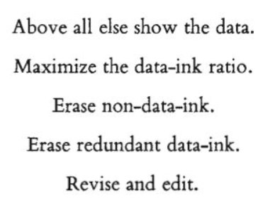
E.R. Tufte, The Visual Display of Quantitative Information
Minimalist charts
Cluttered charts
Take home message:
Franconeri, S. L., Padilla, L. M., Shah, P., Zacks, J. M., & Hullman, J. (2021). The Science of Visual Data Communication: What Works. Psychological Science in the Public Interest, 22(3), 110-161. https://doi.org/10.1177/15291006211051956
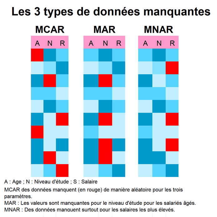
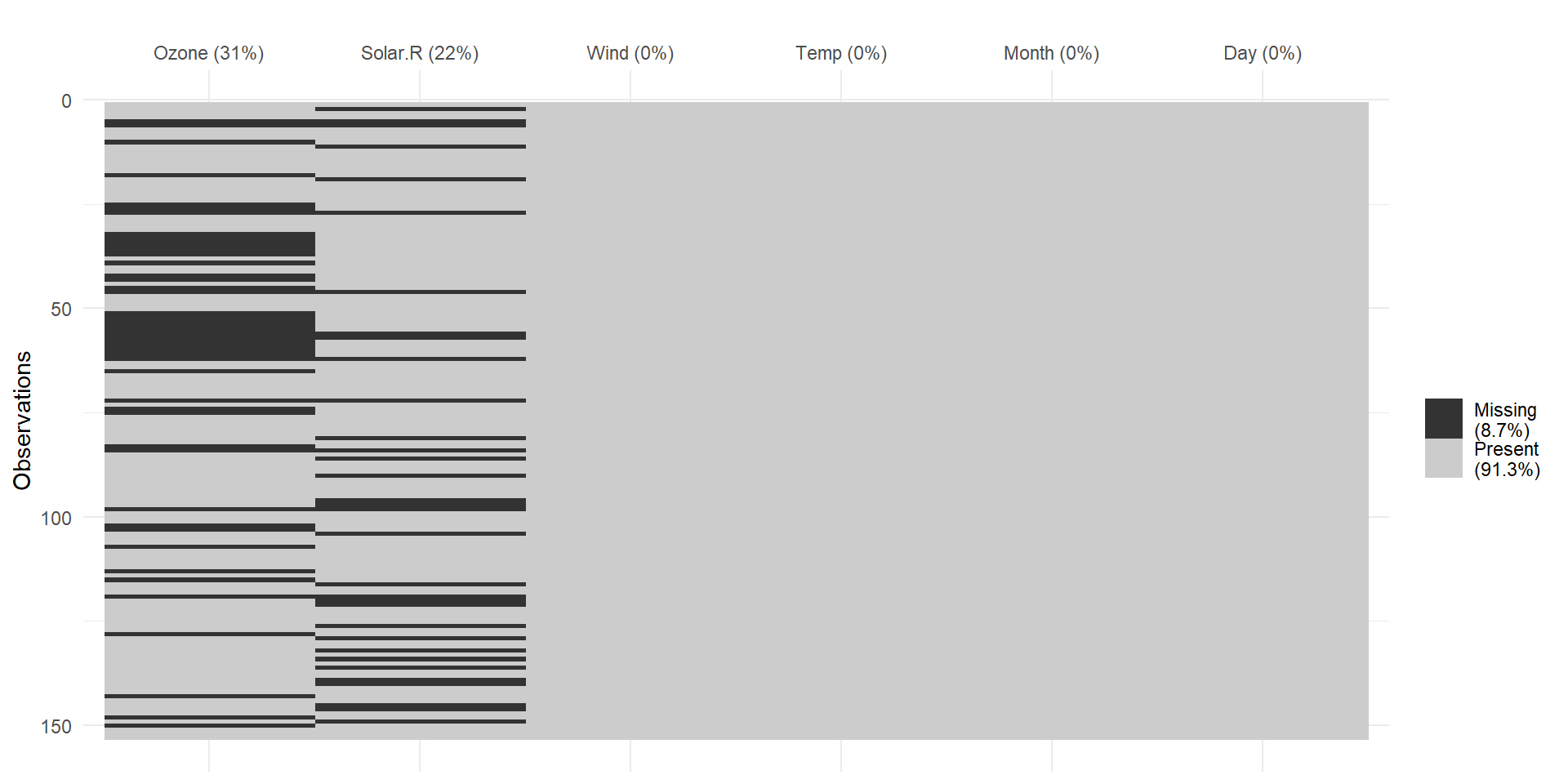
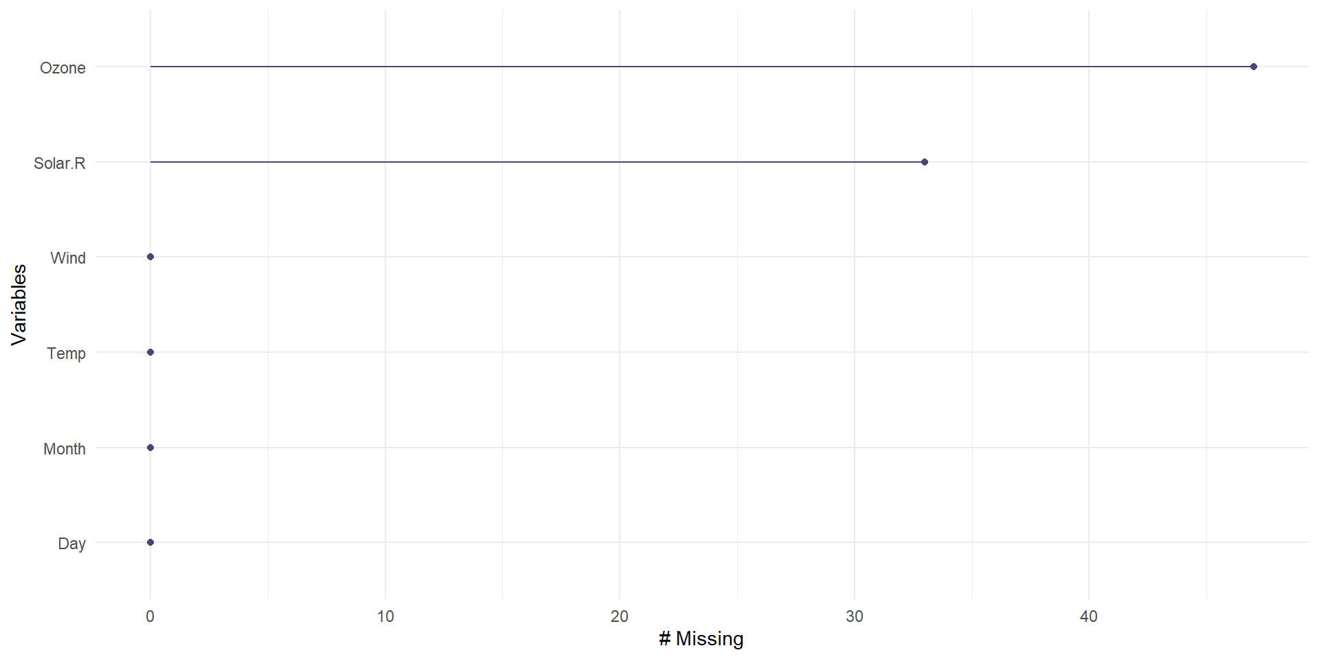
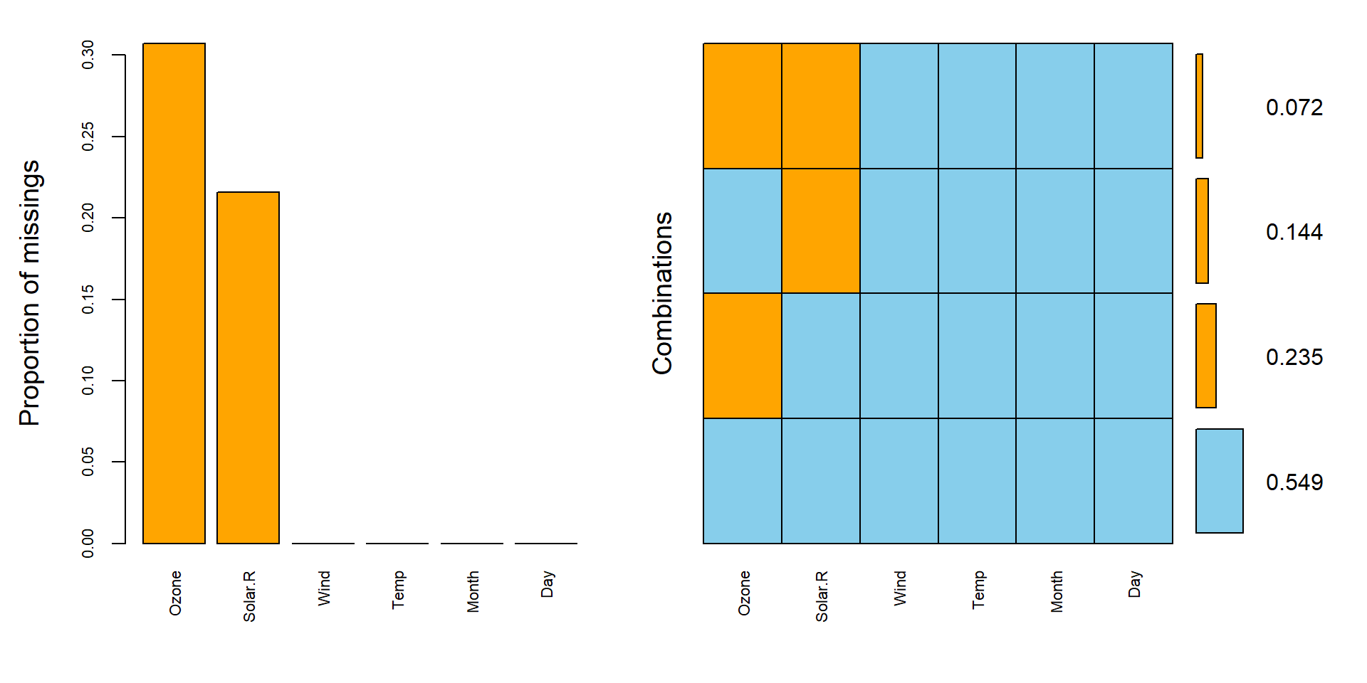
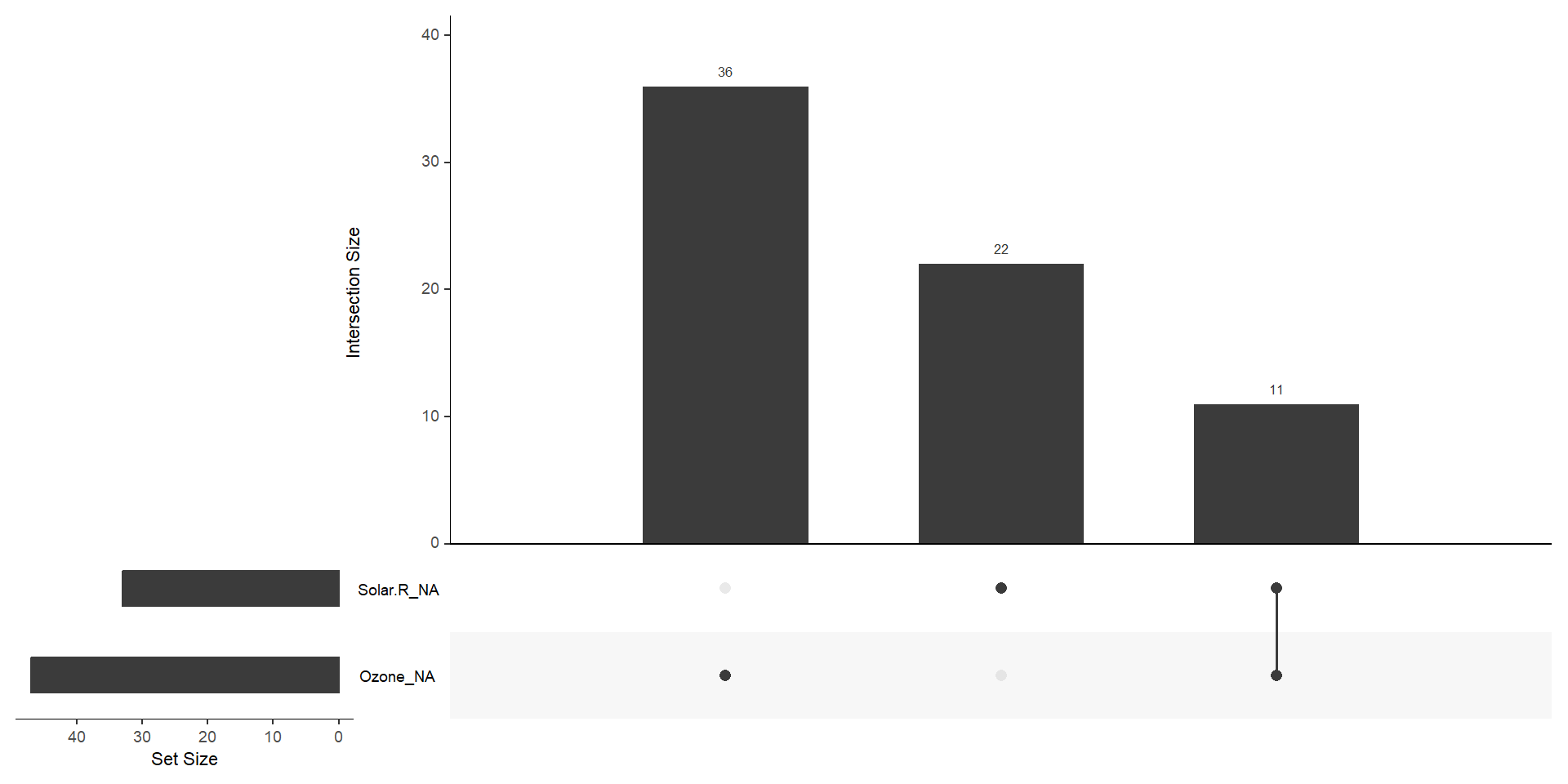
R packages naniar, VIM.
Heatmaps of missingness
→ Where are the gaps in the dataset?
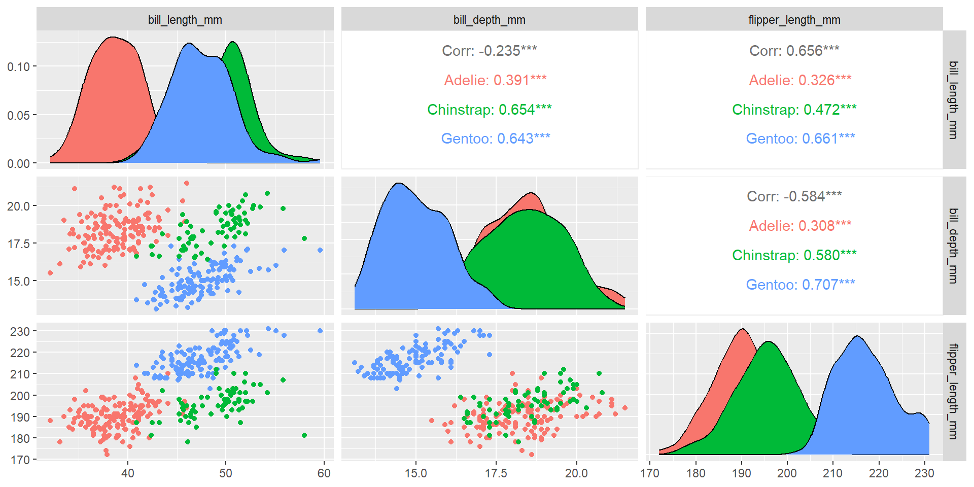
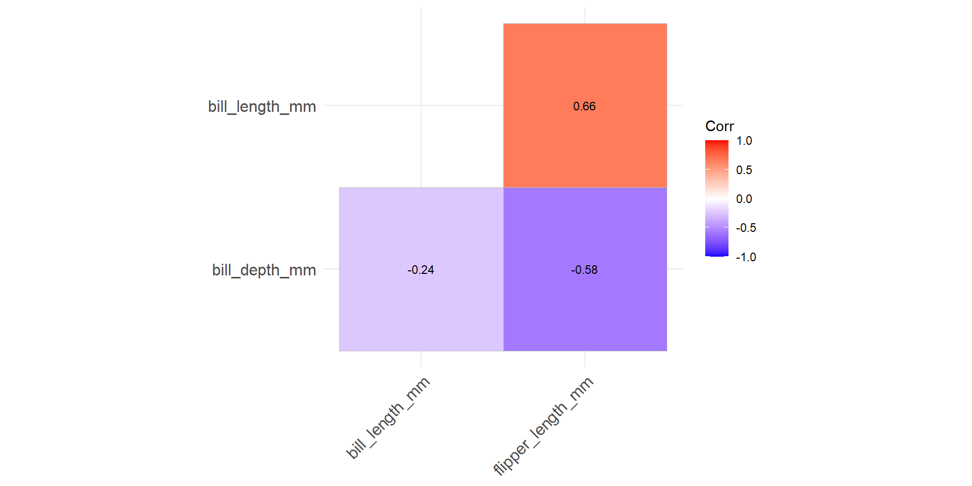
Correlation heatmaps → Compact view of pairwise associations.
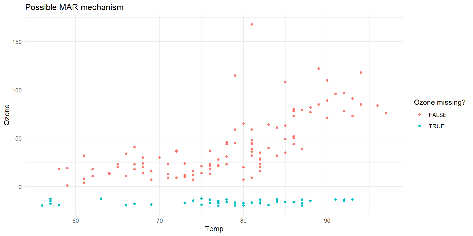
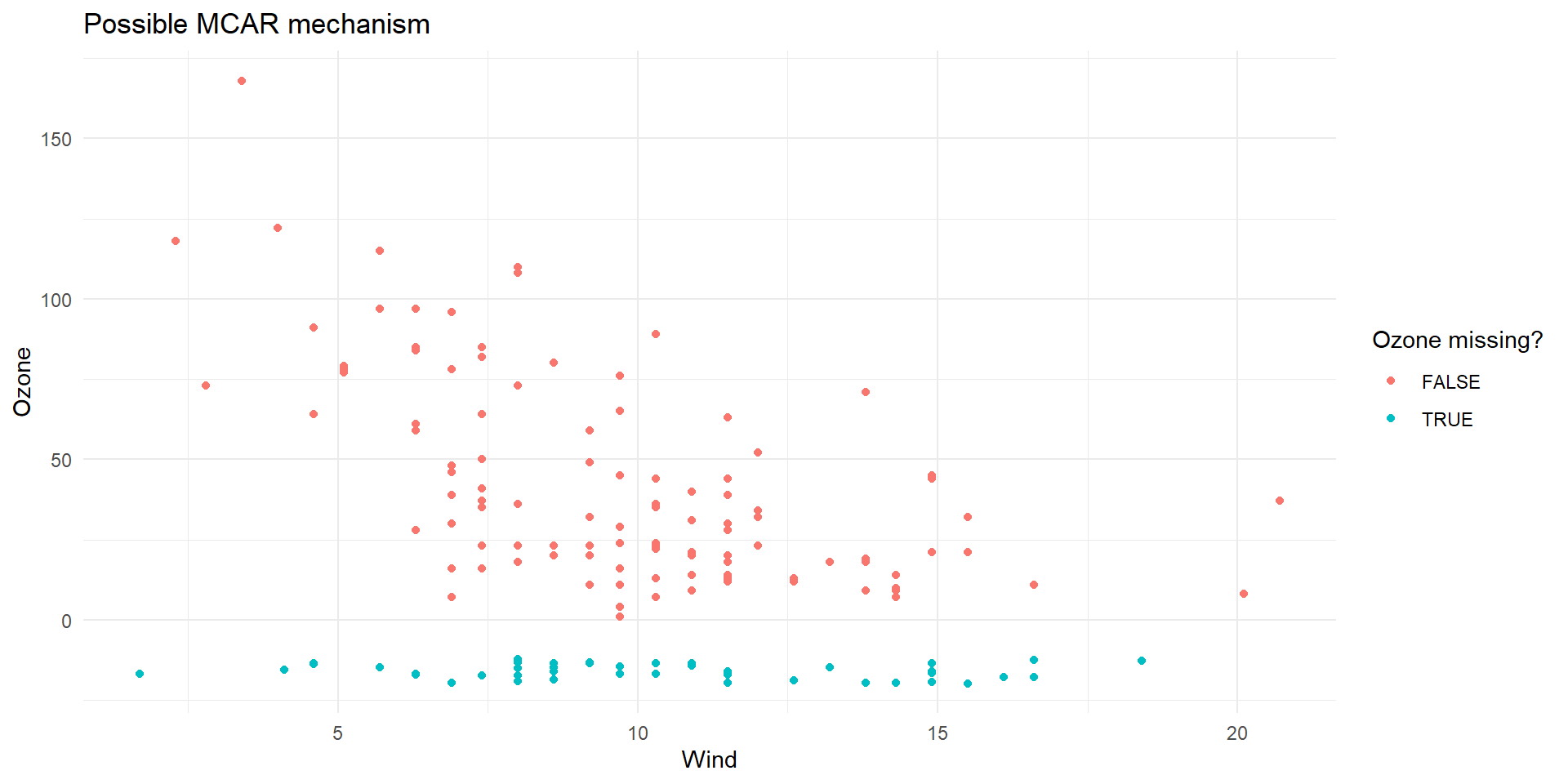
Interpretation:
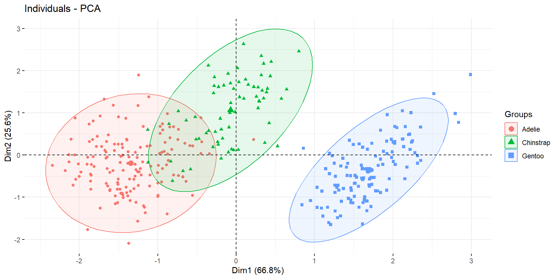
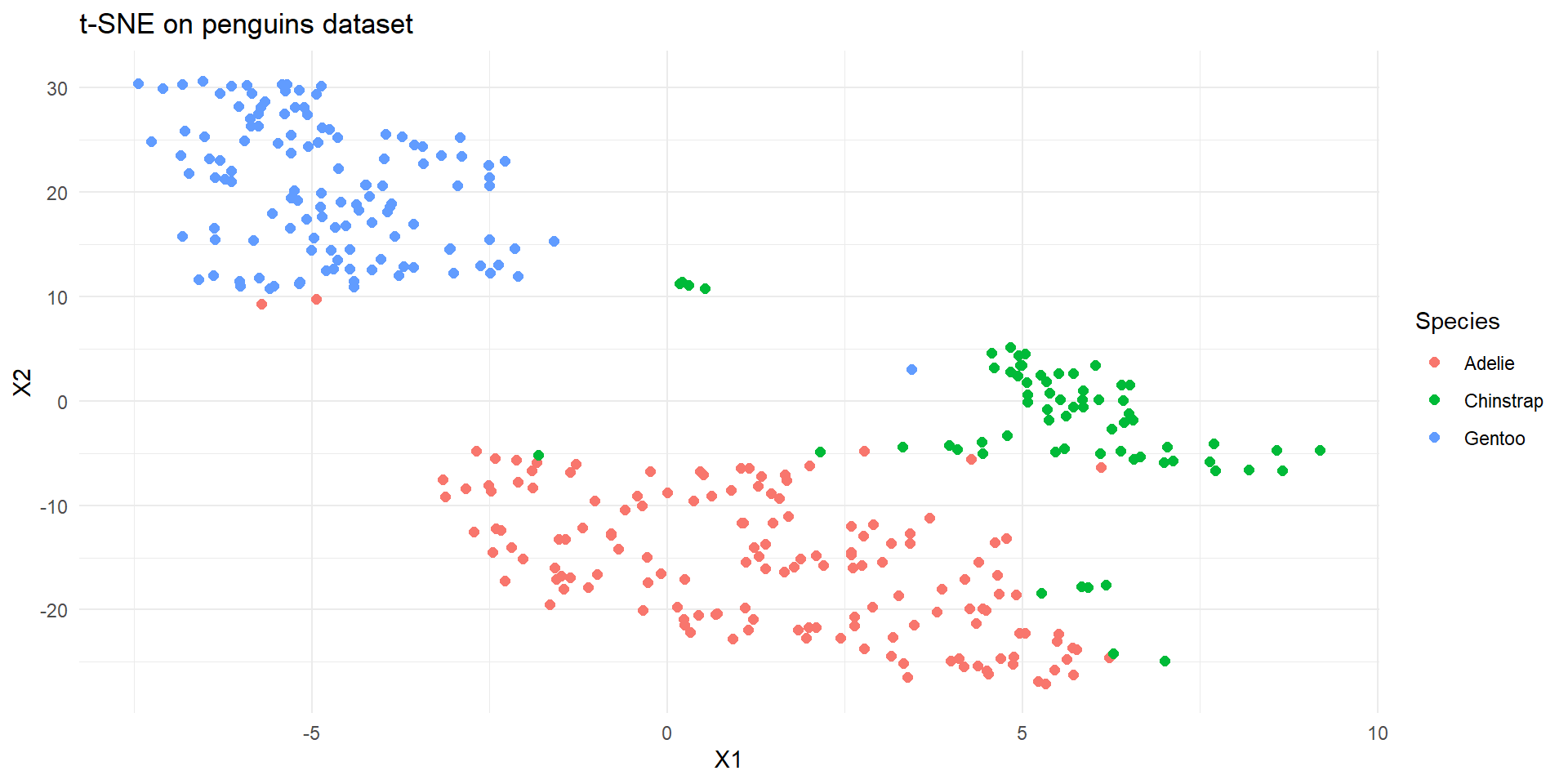
Interactively exploring high-dimensional data and models in R